Author: Xiyan Chen

  • U2 Position Through Dialogue Written Response

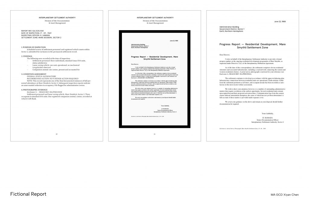
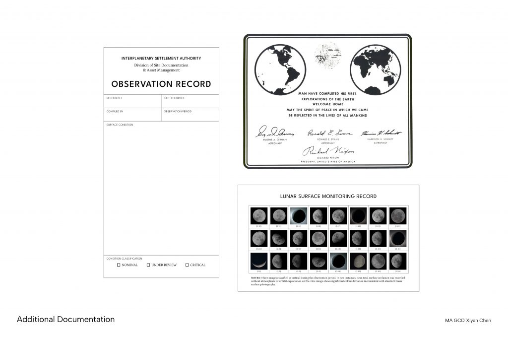
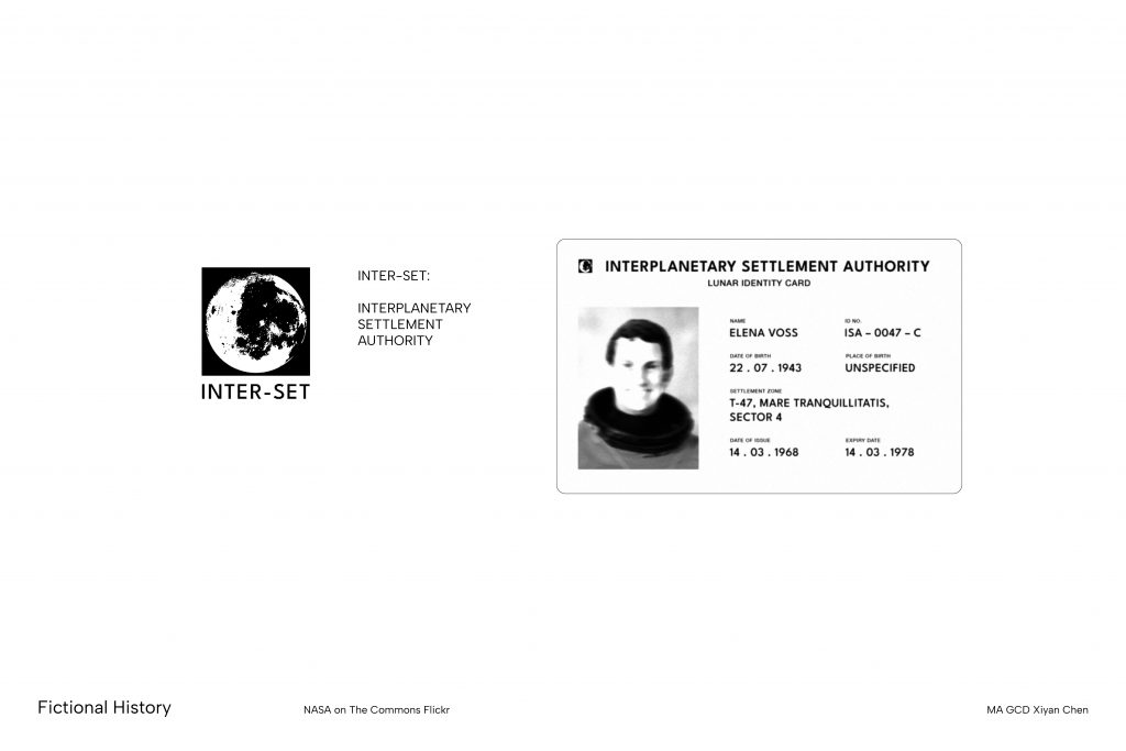
    The series of archival documents created for the fictional institution Interplanetary Settlement Authority (ISA) imagined human settlement on the moon through inspection reports, internal bulletins and observation records. It began as an investigation into authoritative frameworks, including the visual and administrative conventions that make a document feel official and an image feel like authoritative evidence. 

    This project references Allan Sekula’s argument that photographic meaning is not inherent in an image, but produced by the institutions that distribute it and the contexts that receives it (Sekula, 1982). My video essay discussed this idea by suggesting that the frame often generate meaning without not publicly stating its presence and influence on the content being communicated. 

    My dialogue with Jayoon Choi shifted the direction of this investigation. Rather than working with reimagined past, Choi suggested to speculate the possibilities of new futures (Choi, 2026). This would involve methods of speculative design to build a coherent fictional scenario. The question no longer concerned weather a false record would be believes, but how can this authority be extended into a future that does not yet exist. 

    Choi also reframed my discussion of meaning degradation as selective memory. She suggested that mass media circulation is also a form of omission. Information that is retold in many different ways is no longer the same piece of information as the original, and the institutions that control this distribution decide what remains as truth. This pushed me to be more purposeful in the design of this project by making a clearer statement about the construction of truth and trust. There exist concerns around who grants it, and on what grounds. 

    To further my knowledge with the use of AI beyond graphic design, I chatted with an astrophysics PhD Teresa Su to investigate the practical use of LLMs in a field whose purpose is to seek new answers. Our conversation moved the project towards a broader question: how truth is established and trusted, and how AI is disturbing that process. 

    The first images from James Webb Space Telescope and the Hubble Deep Field are pictures of things that cannot be seen with the human eye. They reach us through reconstruction from data, yet has held such social significance because of the institutions behind them. Their credibility relies on historical presumption and trust in institutions to be advocates of the “truth”. However if such trust were built on the design of the frame, then AI generated content can easily reproduce their visual language without any institution at all. 

    Su observed that peer-reviewed publication once signified ultimate research competence, but with the employment of LLMs that lowered the production efforts of papers, trust seem to be increasingly built on a personal level through talks, conferences and in-person discussion (Su, 2026). The adoption of AI is starting to create an atmosphere of skepticism, and the frame is being slowly dismantled. 

    The increased public engagement with AI generated content only accelerates the degradation of meaning and trust. Contemporary media had already been called out for misrepresenting scientific findings for click-bait purposes. The emergence of AI only exacerbates this situation where abundant information is being mistaken as knowledge. 

    Su also notes that all scientific models are considered unreliable, only that some are more useful than others to support the research progress. She sees research as an endless journey to move towards an answer rather than obtaining it. The process involves eliminating incorrect understandings and choosing which assumptions to hold until better ones can be found. 

    After these conversations, my understanding is that there exists no fixed truth, only provisional ones. If truth is provisional, then deciding which answer to believe, and whom to believe it from, becomes a political act. This was also emphasised by Choi’s comment that “everything is political unless it is an airport art” (Choi, 2026). Hence, the question my project tries to ask is no longer reading the frames, but how we deal with an increasing crisis of trust when the frames that once told us what to believe can be generated by anyone. 

    Choi, J. (2026) ‘Conversation with Jayoon Choi’. London.
    Sekula, A. (1982) ‘On the Invention of Photographic Meaning’, Thinking Photography. Communications and Culture. London: Palgrave.
    Su, T. (2026) ‘Conversation with Teresa Su’. London.

  • U2 Position Through Contextualising Final Delivery

    Feedback

    • Political meaning of authority images 
    • What is the narrative I’m trying to convey? 
    • Martha Rosier – extreme contrast between images of different contexts 
    • Joan Fontcuberla – Fauna, Sputnik
    • The Line in Saudi Arabia
    • Chronosis: Exordium by Reza Negatestani and Keith Tilford 
    • Does image restrict the storytelling framework?
    • Can include multimedia formats 
    • Should fictional animals/creatures be created to supplement the imagination or is it limiting the possibilities? 
    • Edits can be moderated to become more believable e.g. houses don’t exist on the moon 
    • Black Mirror – critiquing the science fiction concepts 
    • Conspiracy theory – fake moon landing 
    • Show a progression of timeline and development of the moon civilisation 
    • Further research on archival formats and hidden history
    • Consider the perspective of the storyteller – An animal? A child born on the moon? A reporter from earth? 
    • Eleven Labs – AI voiceover 
  • U2 Position Through Contextualising Visual Development

    • Use of AI tools to reimagine existing archival images
    • References Mark Fisher’s “Lost Futures”
    • Fake encyclopaedia format
  • U2 Position Through Contextualising Initial Research

    Project Inquiry

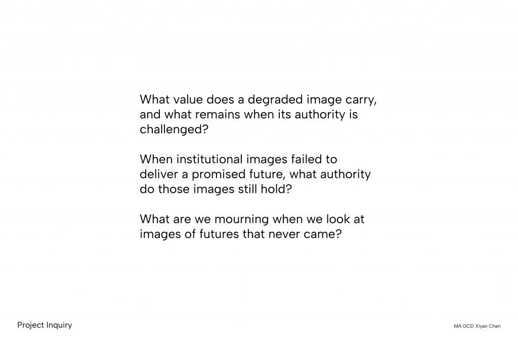
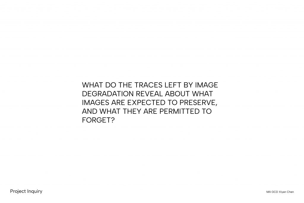
    1. What do the traces left by image degradation reveal about what images are expected to preserve, and what they are permitted to forget?
    2. When institutional images failed to deliver a promised future, what authority do those images still hold?
    3. What does an inventory of abandoned futures reveal about the images we use to imagine what never came?
    4. What makes us believe in the images distributed by authorities? How much of what we believe is the image, and how much is the frame around it? 
    5. What does authority look like when it’s documenting a dream? 

  • U2 Positions Through Iterating 100 Iterations

    Project Description

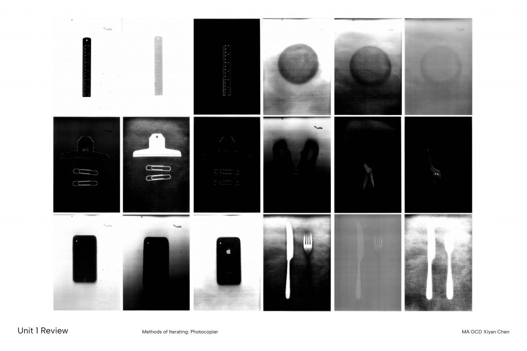
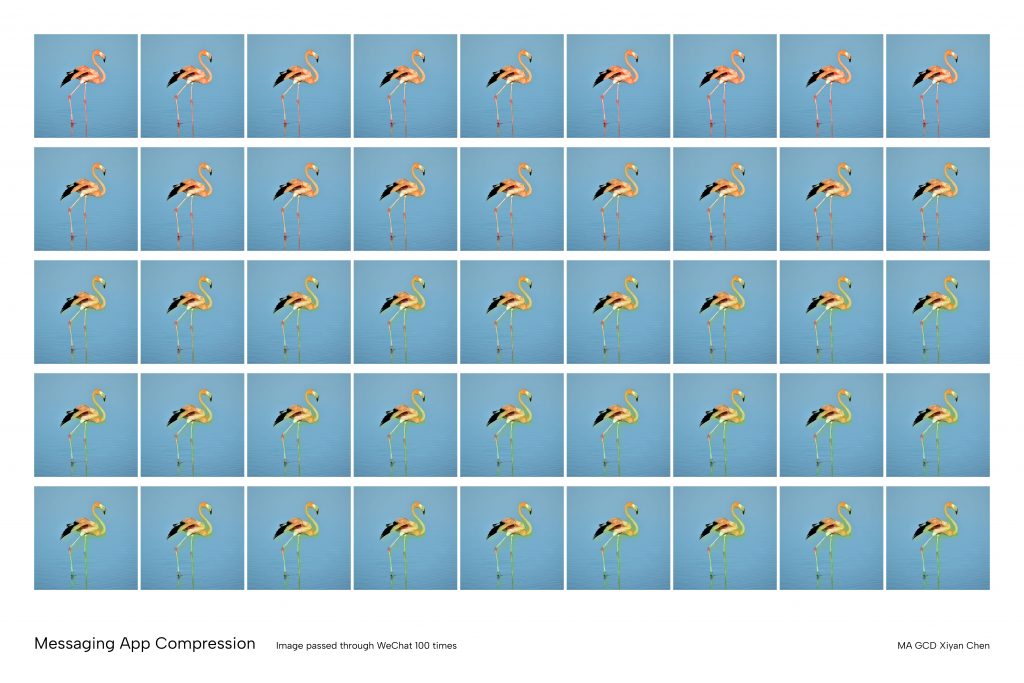
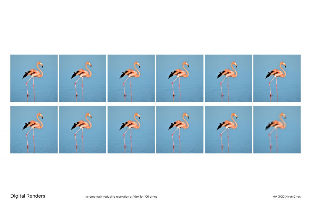
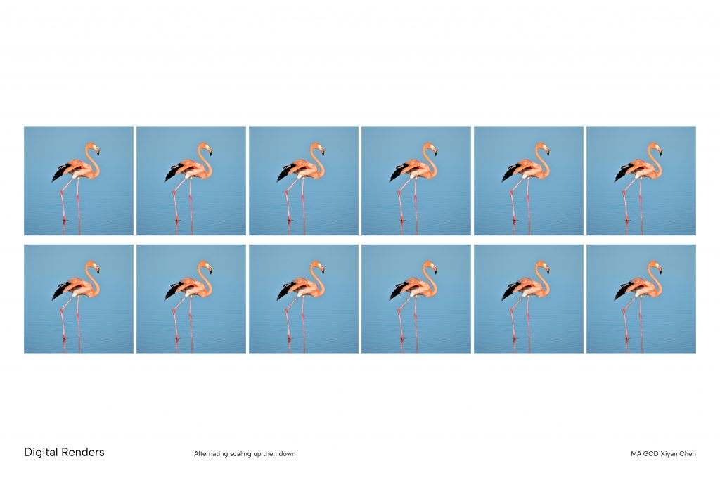
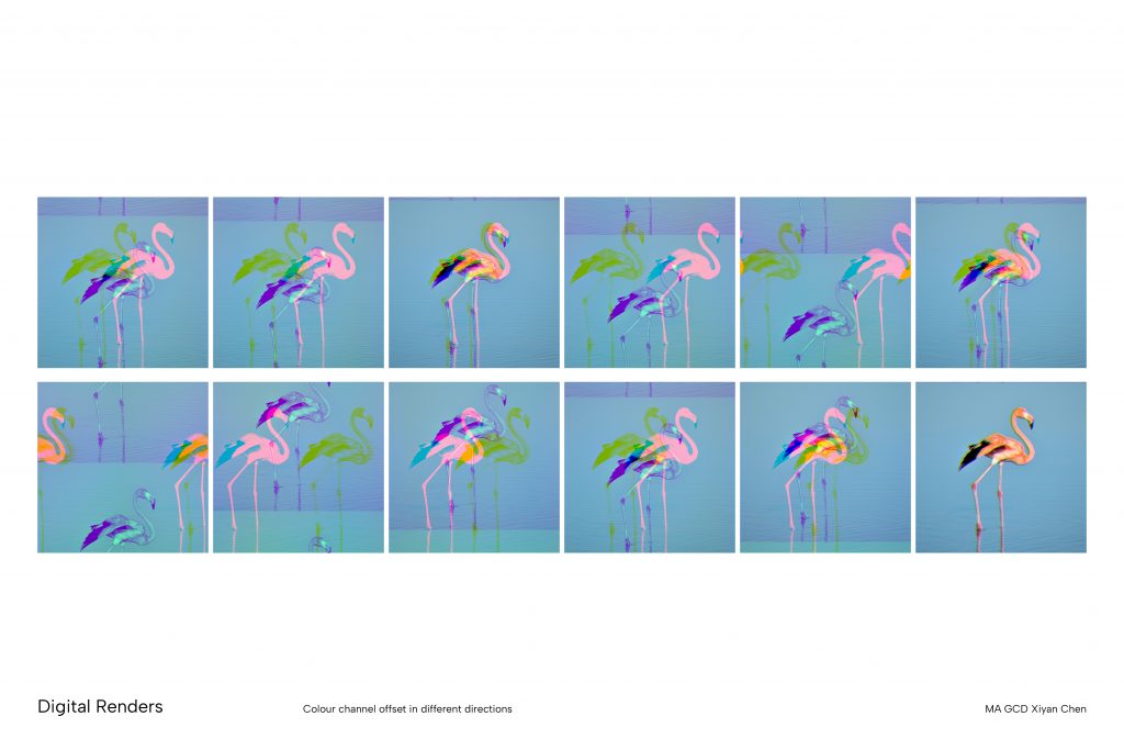
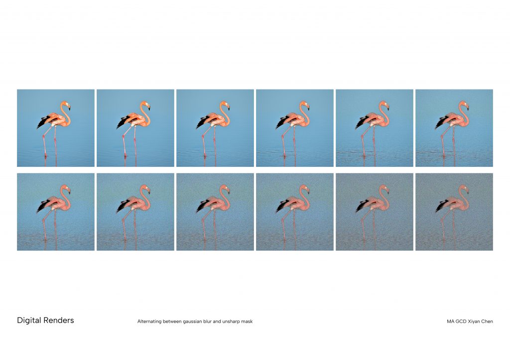
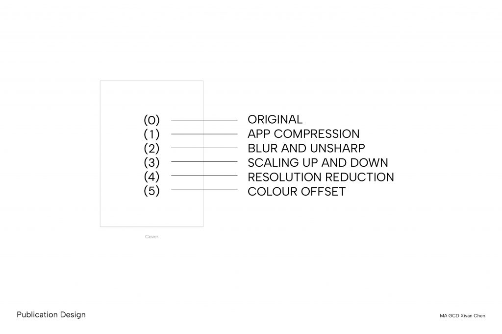
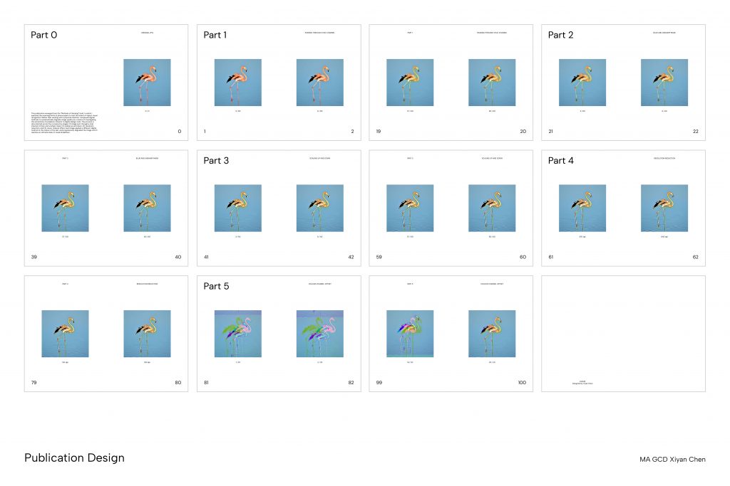
    This publication emerged from the Methods of Iterating brief, in which I explored the scanning limits of photocopiers to test the extent of object visual recognition. Rather than working with a physical machine, I employed digital methods to systematically degrade image quality as a means of investigating the extremities of pixelation inherent to digital design tools. The process is documented across five consecutive stages: (1) image sent through a chat channel, (2) blur and unsharp mask, (3) scaling up and down, (4) resolution reduction, and (5) colour channel offset. Each stage applied a different digital method to the output of the last, and progressively degraded the image until it reaches an ultimate state of visual breakdown. 

  • U2 Position Through Contextualising Written Response

    Annotated Bibliography

    • Encyclopaedia (2024) by Weronika Gesicka 

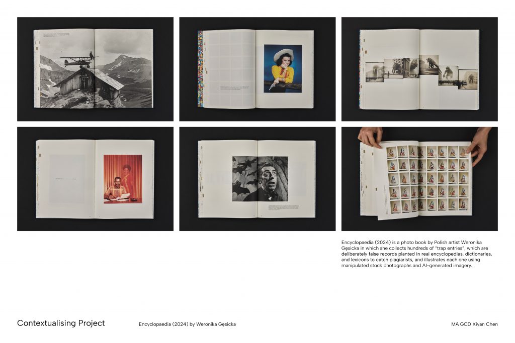
    Weronika Gęsicka’s Encyclopaedia (2024) is an artist book that investigates the conditions under which photographic and textual knowledge is produced, circulated, and trusted. The project takes its source material from “Mountweazels”, which are fictitious entries deliberately embedded within encyclopaedias, dictionaries, and lexicons by editors seeking to detect plagiarism. Gęsicka collected several hundred of these trap entries from historical publications and illustrated them using a combination of manipulated stock photography and AI-generated imagery.

    By adopting the conventions of the encyclopedic format , such as structured entries, authoritative tone, and systematic organisation, Gęsicka critiques the apparatus of knowledge production in her publication. This became the central visual framework for the development of my project. I wanted to investigate if adopting the visual language of authoritative formats could function as a method for exposing the fragility of the credibility those formats. In response, I structured my project around an archive folder containing a series of documents designed to imitate the formal conventions of institutional and academic authority. 

    Where Gęsicka works within the encyclopedic conventions, my project extends this visual framework across a wider range of authoritative formats, each carrying its own set of institutional associations. These included pages and texts modelled on traditional textbook layouts, official certificates, formal reports, and article structures. Each document adhered closely to the visual grammar of its source format, which uses consistent typography, hierarchical organisation and formal register. By reproducing these formats with fabricated content, the project asks at what point would the viewer begin to doubt what they are reading, and what lies at the basis of this authoritative trust.

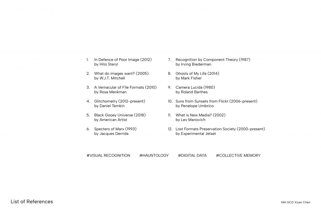
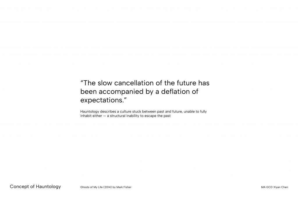
    This practice also connects to my broader enquiry into hauntology as theorised by Mark Fisher. In Ghosts of My Life(2014), Fisher describes hauntology as a culture that looks to the past not out of nostalgia, but because it no longer believes in the future, which is what he calls the “slow cancelation of the future”. 

    Gęsicka’s method of taking images from the existing photographic archive and reworking them through digital manipulation connects closely to this idea. The stock photographs she uses are already a kind of suspended image, produced without a specific subject in mind and waiting to be given meaning. By using them to illustrate things that never existed, and combining them with AI-generated images built from similar sources, Gęsicka created images that feel historical without actually coming from history.

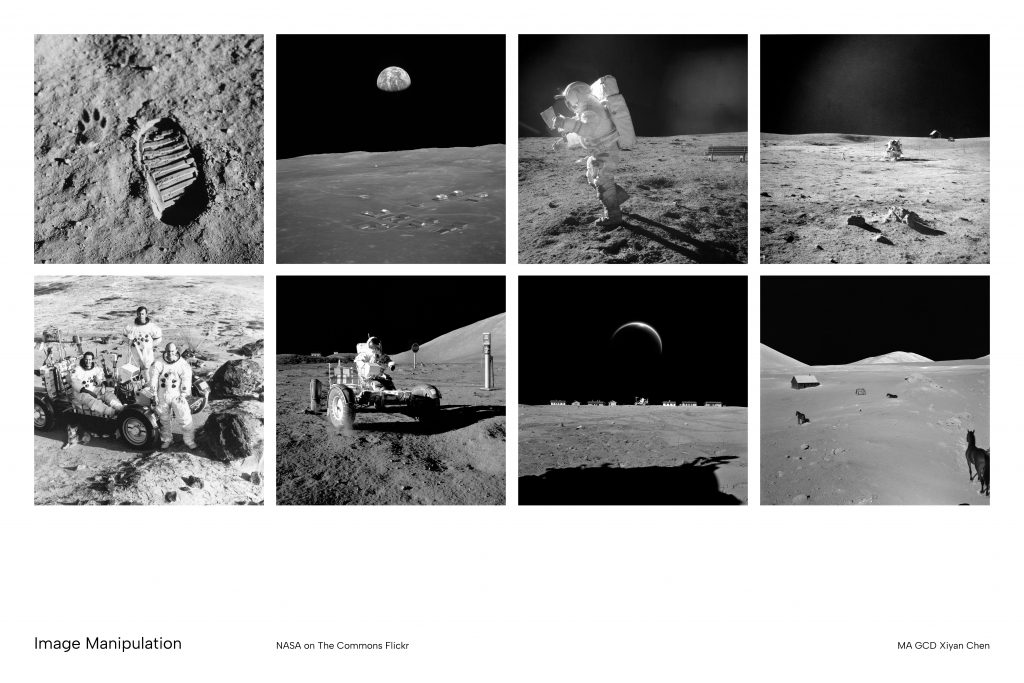
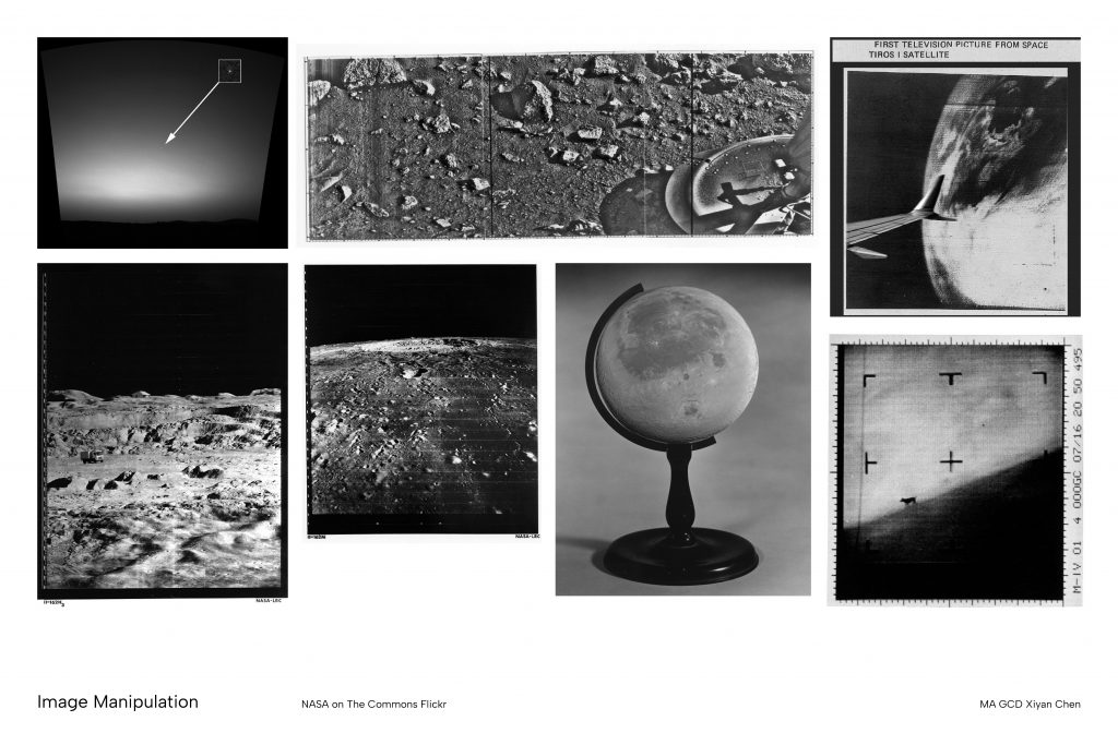
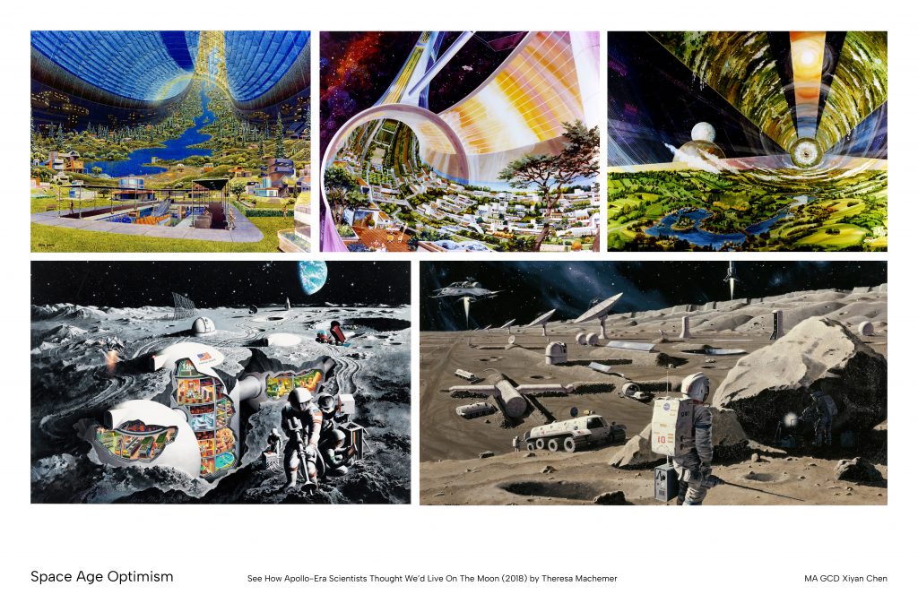
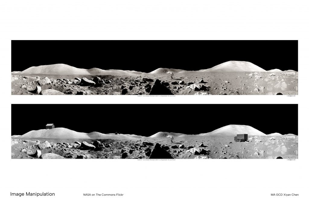
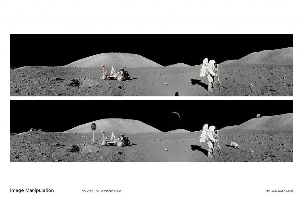
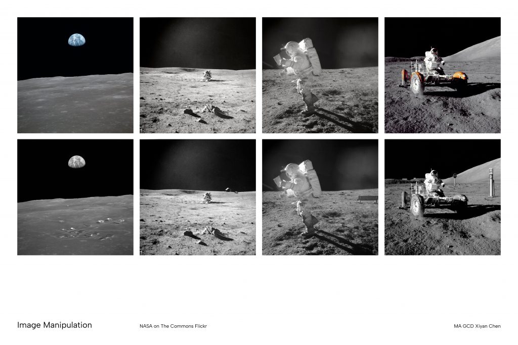
    I adopted a similar method when choosing the visual contents for my project. The images in my archive documents were sourced from official image archives, which already carry the visual authority of institutional record-keeping. I deliberately introduced false and nonsensical elements generated through AI tools to narrate a new fictitious story. The result sits in an uncomfortable middle ground where the found images ground the work in something that feels real and historically credible, but the AI-generated additions introduce details that could not have existed, producing an effect that is simultaneously haunted and plausible. 

    This draws directly on Fisher’s framework where the found images represent a past that culture keeps returning to, and the AI interventions indicates the foreclosure of any stable meaning those images might once have held. Together, they ask whether the feeling that something once existed can be created through visual and formal means alone, even when the event itself never took place. 

    Gęsicka, W. (2024) Encyclopaedia [225×300 mm]. Poland: BLOW UP Press.

    • On the Invention of Photographic Meaning (1982) by Allan Sekula

    Allan Sekula’s essay “On the Invention of Photographic Meaning” challenges the persistent assumption that photographic images carry meaning within themselves. Sekula argues that the meaning of a photograph is never inherent but is always produced through what he calls “photographic discourse”, which is the system of cultural, social, and institutional relations within which an image is received and read. A photograph is not a record but an expression of thoughts.  It is a medium that carries an incomplete message that depends entirely on its surrounding context in order to be understood and circulated. 

    Central to this discussion is Sekula’s rejection of the idea that photography functions as a universal language. He observed that images are widely treated as if their meaning resides within their visual surface independent of any framing. Sekula argues that photographic literacy is a learned set of cultural conventions, and the apparent neutralness of an image is always a product of its contexts. The photograph does not communicate truth, but it is made to appear truthful through the framework in which it is presented. 

    This idea prompted me to look at how authoritative framing operates. If photographic meaning is produced rather than found, then the contexts in which images are placed, such as the captions, layouts, institutional formats, and modes of circulation surrounding them, are thus not neutral containers but active producers of meaning. The same image placed within a scientific report, a personal archive, or an advertising campaign will be read in fundamentally different ways. This is not because the image has been accommodated to different formats, but the discourse framing its purpose and value has changed. 

    Working from Sekula’s argument that the image is neutral until framed, I have been investigating the degree to which authoritative document formats, including certificates, reports, and formal articles would shape how their visual contents are received. This also opened up the idea that entirely fictional histories can be made to feel real not through the fabrication of convincing images alone, but through the reproduction of the formats and conventions within which real histories are typically recorded and circulated. 

    The documents in my fictitious archive folder contain images sourced from official archives, photographs that already carry associations of institutional credibility and historical record. I introduced obviously false and nonsensical elements generated through AI, but rendered such in a visual style that closely matches the surrounding material by manipulating the image grains and lighting. The fabricated images were then incorporated into the formal structure of fictional official documents, inheriting the credibility induced by the authoritative formats. 

    I wanted to create an uncanny and disturbing feeling through these ambiguous images and texts. It was clear that something was wrong but the viewer may not immediately be able to locate where the flaw resides. This aligned with Sekula’s argument that meaning is produced by framing rather than by the image itself, thus a false element introduced within a credible format can also absorb the authority of that format and pass as real. The viewer’s trust is not in the image but in the discourse surrounding it. 

    Sekula, A. (1982) ‘On the Invention of Photographic Meaning’, Thinking Photography. Communications and Culture. London: Palgrave.a

    • Camera Lucida (1981) by Roland Barthes

    Roland Barthes’ Camera Lucida (1980) proposed a distinction between the studium, which is the genera legible context of a photograph,  and the punctum, which are details that would “prick” the viewer unexpectedly. This framework helped me to position my image manipulations within a broader context. 

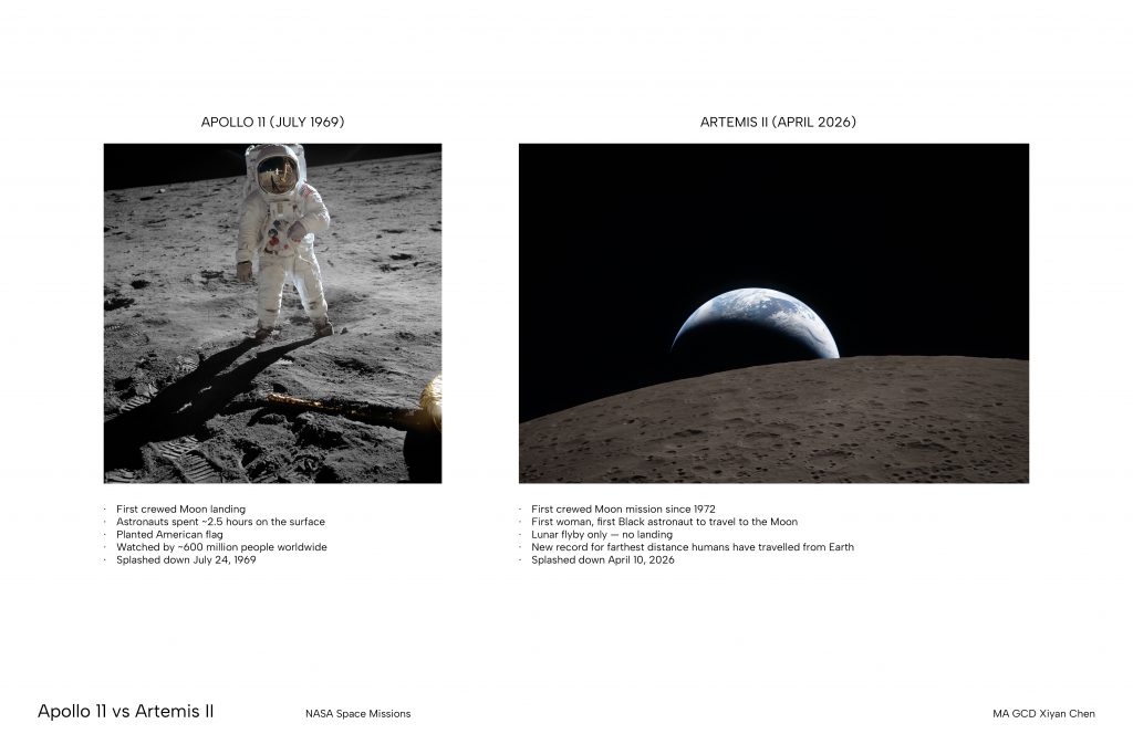
    The NASA Apollo images carry the weight of an bureaucratic studium because they are institutional documentary photographs that are already situated within a familiar historical and scientific context. The AI generated elements I introduced, such as car, dog, and stop sign, thus function as the punctum of these images. They should not be there, but they appear with photographic plausibility, which creates a strong sense of uncanniness and tension. I am interested in how this deliberately introduced wrongness distorts the reality by illustrating a future that was imagined but never arrived. 

    Barthes, R. (1981) ‘Punctum: Partial Feature’, Camera lucida : reflections on photography. New York: Hill & Wang.

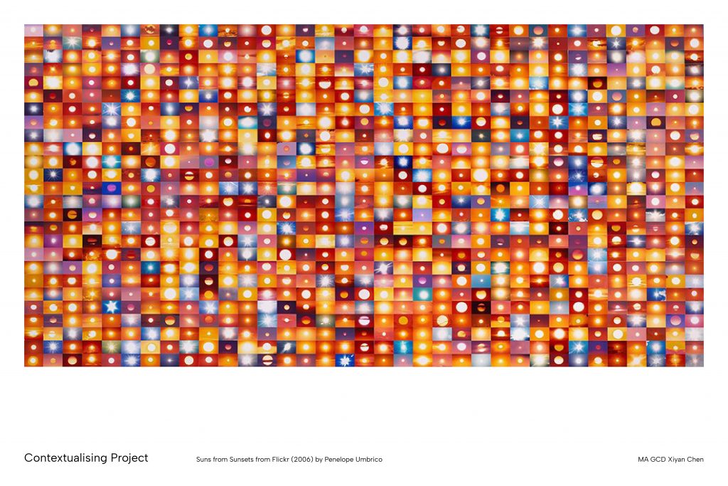
    • Everyone’s Photos Any License (2015-2016) by Penelope Umbrico

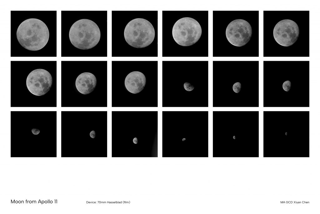
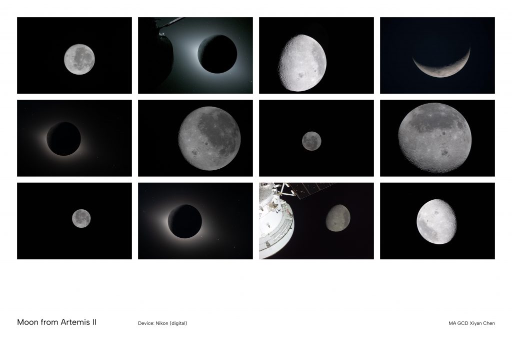
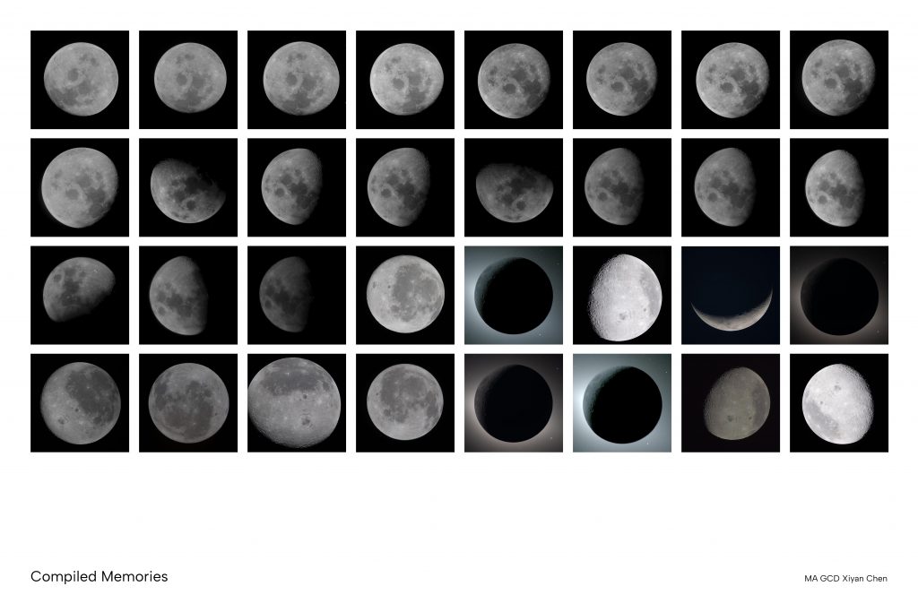
    Penelope Umbrico’s Everyone’s Photos Any License is a collection of amateur moon photographs sourced from Flickr, where she treated the accumulated mass of images as a collective rather than individual acts. This made me consider the power of collection memory. If a collective visual memory of the moon can be constructed through the accumulation of amateur images, then it becomes plausible that a similar accumulation of fabricated settlement imagery might generate its own kind of belief. Hence I curated the photographs to present different dimensions of the narrative by combining mundane rituals with official inspections and events.  

    Umbrico’s work also challenged my assumptions about what counts as an important image. The photographs she works with were never officially published or institutionally verified, yet together they form a significant record of how a culture has looked at and imagined the moon. This contradicts with my use of bureaucratic document formats, which makes me question whether authoritative framing is important for an image, or does it simply make it a piece of political artefact. 

    Umbrico, P. (2015) Everyone’s Photos Any License [collection of photographs].

    • In Defence of Poor Image (2012) by Hito Steryl

    Hito Steyerl’s In Defence of the Poor Image (2009) argues that images degraded through circulation and compression carry their own political and aesthetic value. The resolution of an image is not a neutral technical quality, but is associated with questions of access, power, and what kinds of images are considered worthy of preservation. 

    This shaped my choice of using archival images as a way to exploit this conventional power structure. There is a particular authority attached to low resolution archival imagery, a sense that because it looks old it must be true. I used the assumed credibility of these poor image against itself by deliberately introducing fabricated elements into images that already carry the power of official documentation. The graininess and staged camera angles thus becomes a kind of alibi for its historical value.

    Steyerl, H. (2012) ‘In Defense of the Poor Image’, The Wretched of the Screen. Berlin: Sternberg Press, pp. 31–45.

    • What do pictures want? (2005) by W.J.T. Mitchell

    W.J.T. Mitchell’s What Do Pictures Want? (2005) proposes the idea that images should not be understood as passive carriers of meaning, but with its own agency that exceeds the intentions of their makers. He asks not only what images mean but what they want, treating them as “quasi-subjects” whose effects in the world cannot be fully controlled or anticipated.

    I began to consider this shift of meaning when archival photographs are removed from their original institutional context and used to construct a fictitious history. These images were produced with a specific documentary and propagandistic purpose that is to record and project national authority. But by introducing fabricated elements into them, I am allowing the images to shift toward a life that was never part of their original intent. Mitchell’s discussion on the social life of images is also relevant when archival photographs do not remain fixed, but accumulate new meanings as they circulate and get repurposed. Thus my manipulation is not a destruction of the original images, but a continuation of a process that was always already happening.

    Mitchell, W.J.T. (2005) What Do Pictures Want: The Lives and Loves of Images. University of Chicago Press.

    • Invisible Cities (1972) by Italo Calvino 

     Italo Calvino’s Invisible Cities (1972) is a series of descriptions of imaginary cities narrated by Marco Polo to Kublai Khan. The Khan’s empire has grown too large for him to visit directly, so Marco Polo’s descriptions become a substitute, a way of knowing places through language and inventory rather than experience.

    Based on this fictitious narration, I chose not to construct a direct narrative of the moon settlement but instead to leave behind fragments, such as inspection reports, identification cards, observation records, and condition surveys. The story is never told directly but implied through the accumulation of partial evidence, in the same way that Calvino’s cities are never visited but only described. Fictitious storytelling of this kind does not offer a definitive truth but creates an impression, a sense that something happened here without ever fully saying what. Calvino’s taxonomy of imaginary cities suggests that the act of cataloguing is itself a way of imagining, and that an inventory of things that never existed can carry as much weight as a record of things that did. 

    Calvino, I. (1972) Invisible Cities. Orlando: Harcourt Brace & Company.

    • What is New Media? (2002) by Lev Manovich 

    Lev Manovich’s The Language of New Media (2001) argues that new media fundamentally reorganises cultural production around the logic of the database. Manovich suggest that the new media is a collection of items without inherent narrative order, and that the automation of media production transforms the relationship between authorship and the image. 

    This phenomenon can be observed in the AI generated elements I introduce into NASA photographs. These visuals are products of database logic that have been assembled from collections of existing image data, which is a process of selecting and recombining visual references rather than originating new sources.

    This prompted the question: If the fabricated elements in my images are drawn from the same collective visual culture as the archival photographs themselves, then the distinction between document and invention becomes harder to maintain. The precarious use of AI generative tools reflects a broader shift in how images are produced and what authorship means. 

    Manovich, L. (2002) ‘What Is New Media?’, The Language of New Media. Cambridge, MA, USA: MIT Press (Leonardo), pp. 18–55.

    • Depravity’s Rainbow (2018-2023) by Lewis Bush 

    Lewis Bush’s Depravity’s Rainbow (2019) use photography and archival material to explore the violent origins of space exploration by tracing its history from Nazi rocket technology built on slave labour through to the postwar careers of the same scientists at institutions such as NASA. The project argues that the militaristic and imperial dimensions of space exploration have consistently concealed themselves behind a narrative of peaceful scientific progress. 

    This project introduced me to the political and social sides of bureaucratic images. The NASA photographs I use as source material are already products of a visual and political culture that carefully managed what space exploration was to be publicly received. Bush’s project makes visible the history that official documentation actively works to suppress. I also referred to Bush’s method of combining contemporary and archival images as a way to construct rather than simply record narratives. This informed my understanding on the power of manipulated images to illustrate fictions by assembling the appearance of institutional truth.

    Bush, L. (2023) Depravity’s Rainbow [20×25 cm]. London: Disphotic Editions.

    • Ferox, the Forgotten Archives (2018) by Nicolas Polli 

    Nicolas Polli’s Ferox: The Forgotten Archives (2018) constructs a complete fictional institutional history of a fabricated space agency, presented entirely through the visual language of official scientific documentation. Polli demonstrates that committing fully to the formal conventions of scientific and administrative documentation is itself a conceptual act, the design is not illustrating a fiction but producing the conditions under which the fiction becomes believable. This became the central visual inspiration for my project. 

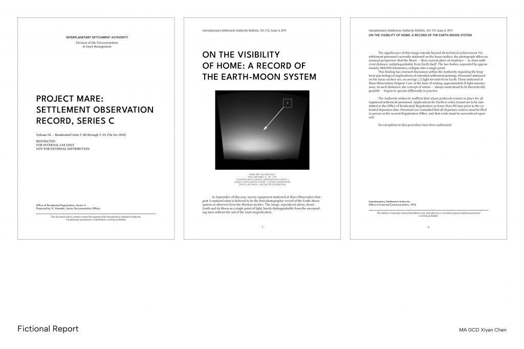
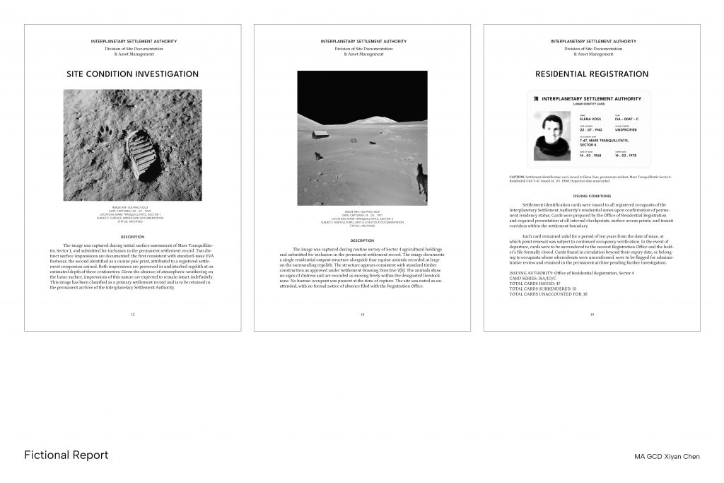
    The book’s use of dense data tables to catalogue meteorite observations with columns for classification, date, country, and region, formatted with the neutral typographic logic of International Style design. Handwritten letters, reproduced on dark backgrounds, introduce a personal register that sits against the clinical objectivity of the surrounding data. This reinforced my exploration with the specificity of official document formats, such as scanned letters, officer names, and record cards. I also employed consistent typography, layout, and information hierarchy throughout the publication to demonstrate institutional authority. 

    Polli, N. (2018) FEROX, The Forgotten Archives [21.5x30cm]. Ciao Press.

    • The Burden of Representation (1988) by John Tagg

    John Tagg’s The Burden of Representation (1988) argues that photographs do not inherently carry truth, but are granted authority by the institutions that produce and circulate them. The medium of photography was adopted by state bureaucracies because it could be made to appear objective, hence its meaning is conveyed by the institutional context in which it appears. The document, the file, and the official report formats in my archive are the frames that make a photograph evidence rather than image.

    By placing manipulated photographs inside bureaucratic document structures, complete with reference numbers, issuing officers, and classification systems, I am replicating the exact mechanism Tagg describes. The form carries enough authority to make the fiction feel like documentation. I also became more conscious of the ideologies being imposed by the formal systems, whether the archive is critiquing that authority or being restrained by the kind of content that can be used to depict fictitious narratives. 

    Tagg, J. (1988) The burden of representation : essays on photographies and histories. Basingstoke: Macmillan.
  • U2 Position Through Iterating Written Response

    Project Inquiry

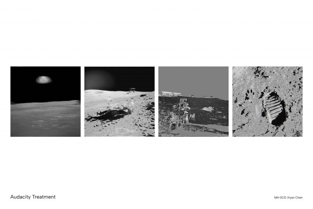
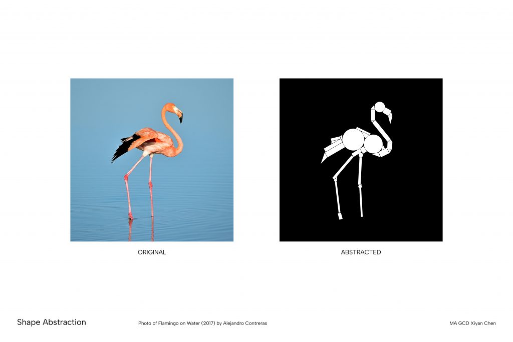
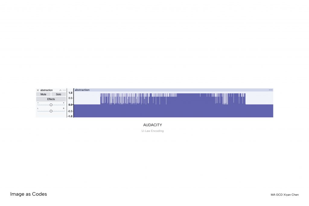
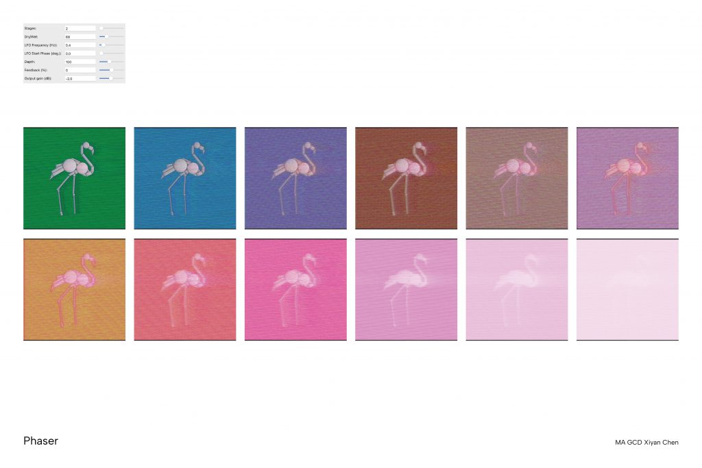
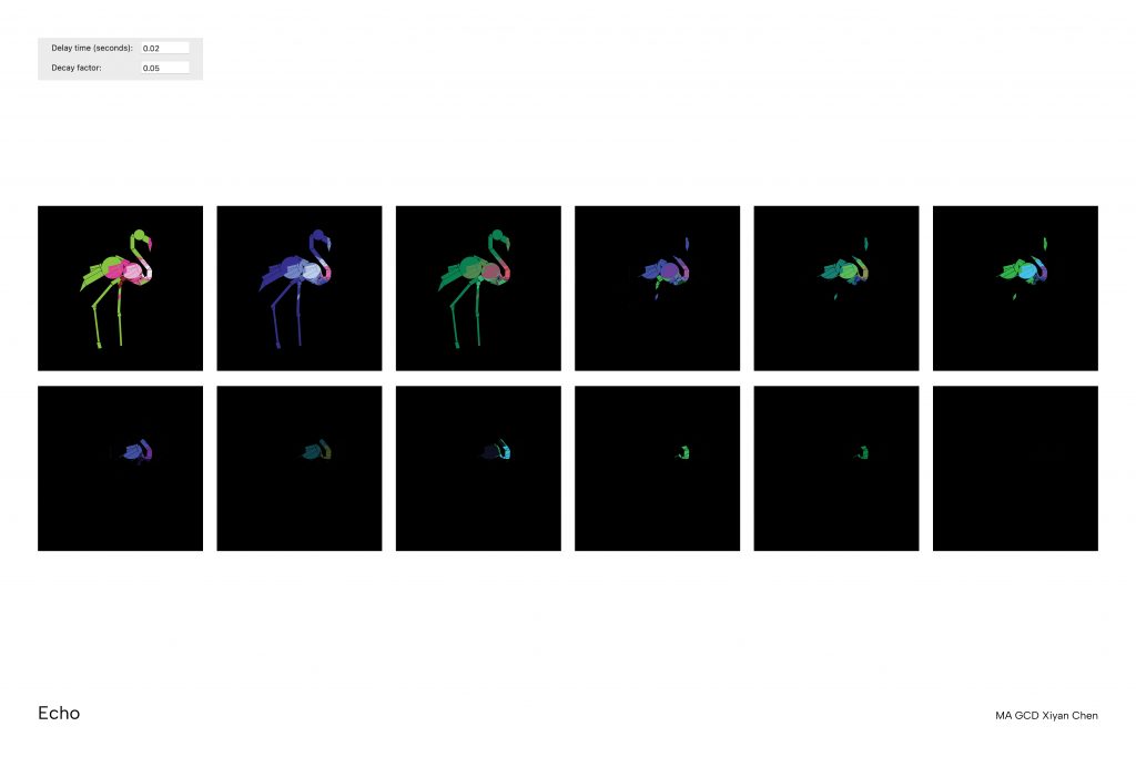
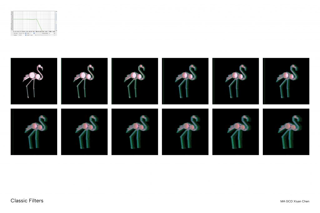
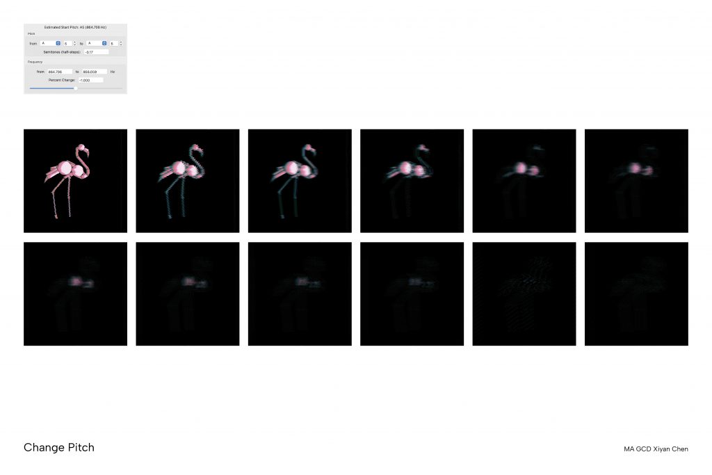
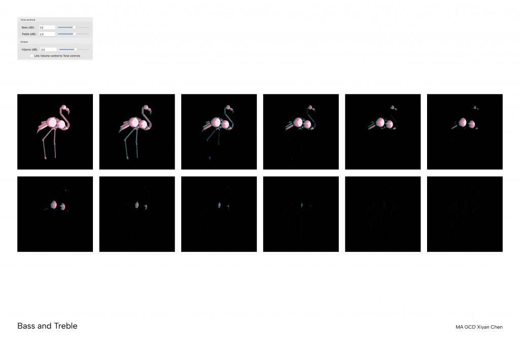
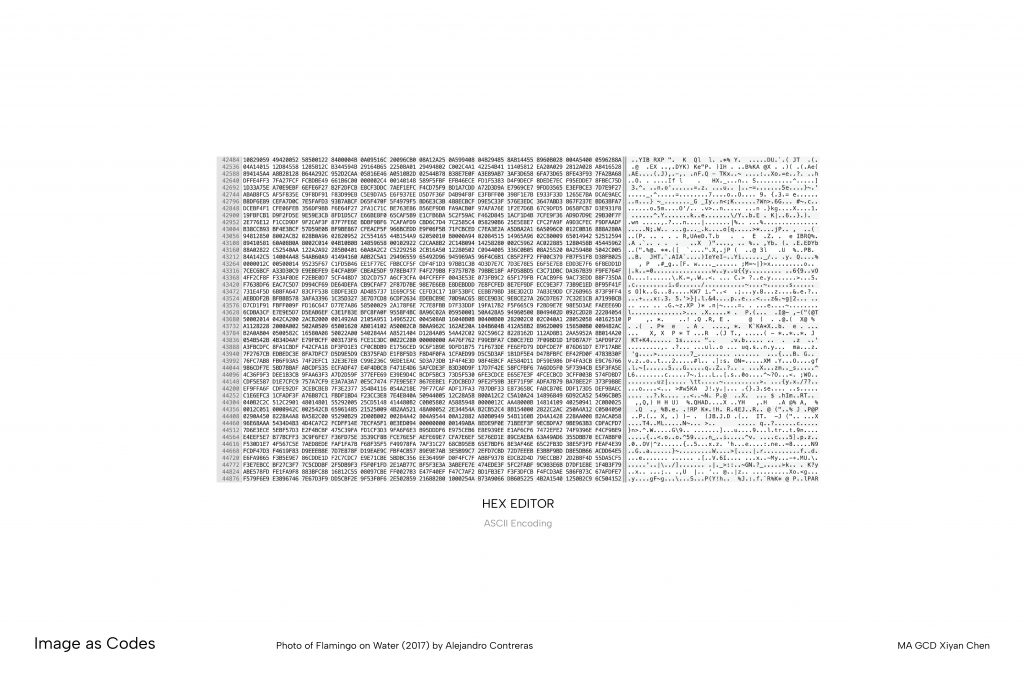
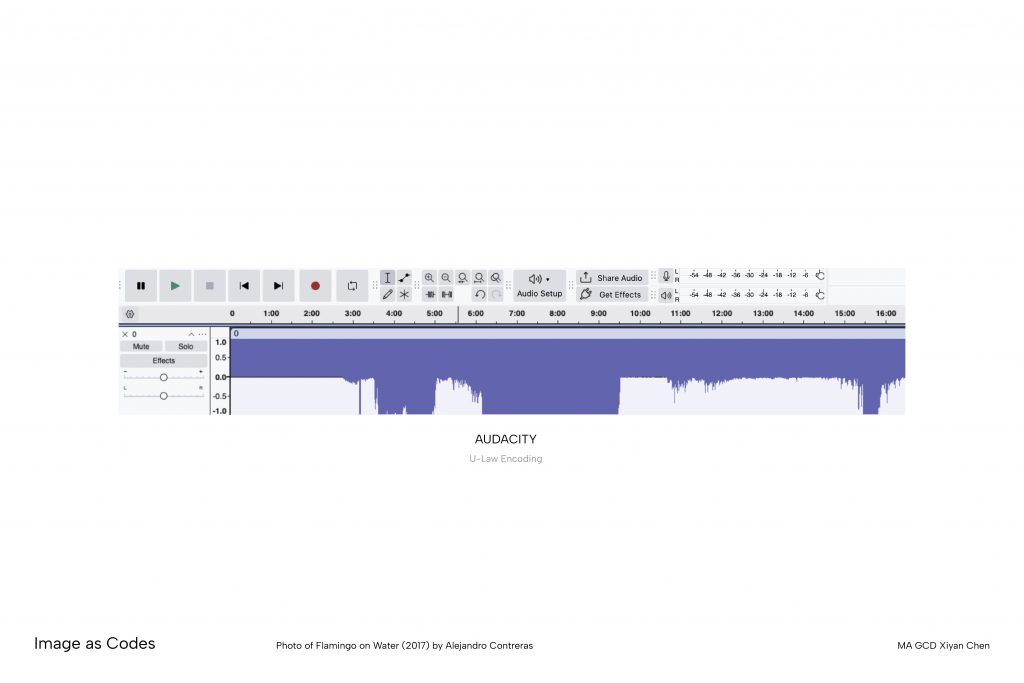
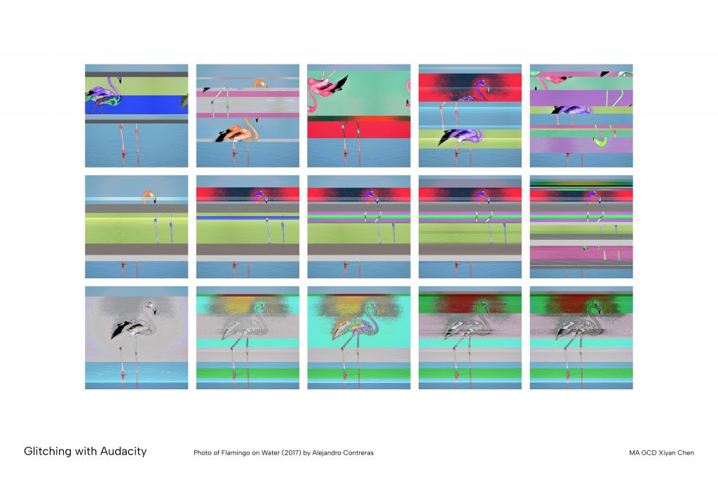
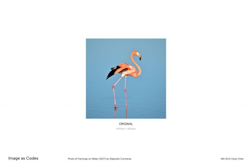
    This project seeks to ask what happens to an image as it falls apart? Starting with a flamingo photograph from the internet, I incrementally degraded its image quality before reducing it to a series of geometric shapes. The image file was then processed through Audacity where I applied various filters that slowly destroyed the data until figure became unfathomable. The image was treated as something unstable, that is prone to corruption in the same way any digital file can be. I compiled the outputs into a gif that plays the degradation in a loop, so the flamingo dissolves and reforms over and over. 

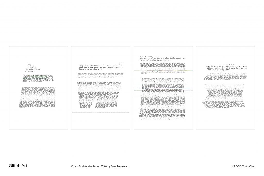
    This method sits within the glitch art movement, which treats errors and data corruption not as failures but as a method of exposing the hidden structures of digital media. As an image loses quality it also loses status, becoming a degraded copy of something that once existed in a more complete form. This connects to the nostalgia for early internet and pre-digital visual culture, and the way a low quality image carries the weight of something partially forgotten. I am interested in the threshold where the image becomes unrecognisable, and what that moment reveals about the relationship between visual form, data, and memory. 
    Annotated Bibliography

    • In Defence of Poor Image (2012) by Hito Steyerl 

      Hito Steyerl argues that the poor image, degraded through uploading, downloading, compression, and re-sharing across digital networks, is not a failed copy but a form with its own political and aesthetic value. Its low resolution and visual noise are evidence of circulation, displacement, and survival outside commercial systems rather than signs of failure.

      Directly referencing this idea of image pixelation, I circulated an image through a chat channel 100 times to observe the compression artifacts not as damage pixels, but as an accumulative record of the image’s passage through networked infrastructure. 

      The subsequent Photoshop-based pixel degradation and Audacity glitching experiments extend this further by subjecting the image to repeated misreading and reinterpretation by methods not intended for continuous application. The series of Audacity processed frames visualise this accumulation over time, each stage of dissolution carrying its own visual weight and aesthetics rather than simply marking a loss of information. This aligns with Steyerl’s argument that pixelation and degradation are not errors to be corrected but meaningful residues of a image’s journey through digital systems. It documents the image’s life as it travels, breaks down, and becomes something new. 

      Steyerl, H. (2012) ‘In Defense of the Poor Image’, The Wretched of the Screen. Berlin: Sternberg Press, pp. 31–45.

      • Black Gooey Universe (2018) by American Artist

        American Artist argues that the graphical user interface (GUI) is not a neutral surface but an ideological one as it shifted from black command-line screen to white GUI encoded whiteness as the default condition of computing. Artist proposes “black gooey” as a counter-interface built on brokenness and refusal that resists the conventional smooth usability of white GUI. 

        I adopted this ideology by translating the original photograph into a black and white image, and positioned blackness as the ground with a white geometric flamingo. This aligns with Artist’s argument that blackness is always already foundational to the screen. 

        The image degradation process then demonstrates this idea visually as I incrementally applied audio filters in Audacity to dissolve the flamingo into its surrounding blackness, returning the image to what Artist suggests was always its basis. This was reinforced by a material observation during the process: black areas of the image were registered as a flat line in Audacity, data-less and silent, while the white figure carried all the signal. The glitches produced by misread image data also reflects Artist’s exploration of brokenness as a mode of resistance against the seamless legibility of the conventional interface. 

        American Artist (2018) Black Gooey Universe, unbag. Available at: https://unbag.net/end/black-gooey-universe(Accessed: 21 April 2026).

        • A Vernacular of File Formats (2010) by Rosa Menkman 

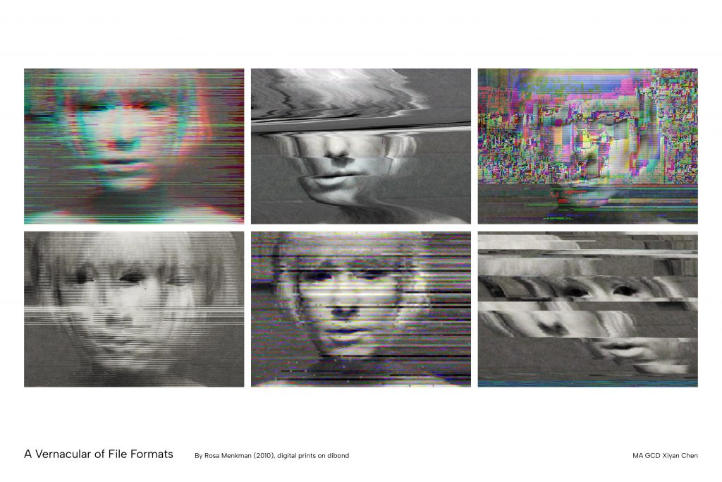
          A Vernacular of File Formats catalogues the distinct visual noise produced when image files (JPEG, BMP, TIFF, GIF) are data-bent to produce a unique aesthetic signature. Menkman treats these format-specific glitches not as accidents but as a kind of material language, arguing that corruption makes visible the hidden architecture of how digital images store information.

          This inspired my exploration of Audacity as a way to create deliberate errors in the encoding of images. Translating image data into an audio processor breaks down the distinction between formats, which highlights Menkman’s idea that all digital files are composed of the same underlying binary data. The degradation effect I applied is therefore not destructing but reinterpreting the image data through a mismatched system. Through this process I came to appreciate the visual aesthetics that emerges from these errors. The glitches are not noise to be corrected but information made legible when the system is failing to conceal its own workings.

          Menkman also notes that the number of pixels and compression structure encoded in each format determines how corruption distributes across the image, which shaped my choice of source format (BMP and TIFF files) when preparing my images for processing. 

          Menkman, R. (2010) A Vernacular of File Formats [digital prints on dibond]. Available at: https://beyondresolution.info/ABOUT (Accessed: 23 April 2026).

          • Glitchometry (2012-present) by Daniel Temkin 

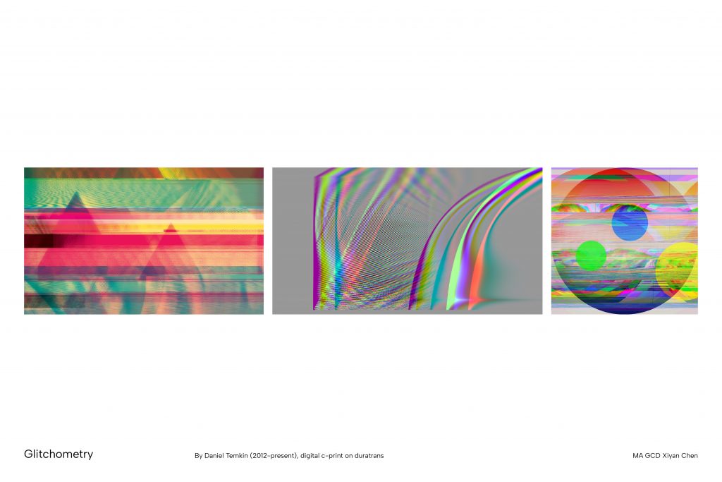
            The Glitchometry series works extensively with geometric shapes, grids, gradients, and colour fields rather than figurative imagery, deliberately removing representational content so that the effect of each transformation is more legible. This directs viewer’s attention entirely towards the distortion of the data, how colour values shift, how block structures emerge, and how compression artefacts form patterns from the original composition. 

            My project embodied this focus on geometric abstraction. By constructing the flamingo from simple white geometric shapes on a black ground rather than using a photograph, I removed the colour and gradient content of the image to focus on the noises that would emerge from the databending process. 

            Temkin’s focus on how geometric forms respond to systematic transformation also inspired me to develop my degradation frames into an animation. I experimented with many different blending modes in After Effects to test how different layer order and transition effects would interact with the processed images to produce unexpected colour. Rather than treating the animation as a neutral sequence of outputs, I used the blending stage as an additional site of formal exploration, finding that certain modes generated chromatic shifts that significantly strengthened the visual intensity of the overall work.

            Temkin, D. (2012) Glitchometry Series [digital c-print on Duratrans]. Available at: http://danieltemkin.com/Glitchometry(Accessed: 21 April 2026).

            • Recognition by Component Theory (1987) by Irving Biederman

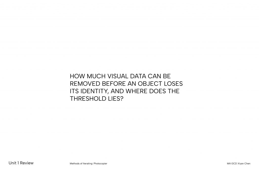
              Biederman’s Recognition by Components (RBC) theory describes how the human visual system parses objects into volumetric primitives ‘geons’, and how recognition fails when the contours defining these components are continuously obscured. 

              This framework informed the translation of my flamingo image from a photograph to a vectorised form. I reduced the flamingo to its essential geometric basis (circle, rectangle, and triangles) to focus on the threshold of geon-based recognition. The flamingo’s geometric shapes remain identifiable despite noise and distortion, until a certain threshold when the image collapses into unrecognisable fragments where the components can no longer be reconstructed, and the image ceases to be legible as a figure. 

              This threshold is further complicated by the Audacity databending process, in which image data is progressively displaced across the waveform. As the white figure migrates and distorts, the spatial relationships between geons break down incrementally, demonstrating the degradation conditions Biederman identifies as critical to recognition failure. It was important to note that even in heavily distorted stages, the flamingo retained a legible wholeness in its outline, which carried sufficient symbolic resonance to sustain recognition. This suggests that cultural familiarity with an image can extend the threshold of recognition beyond what RBC’s purely structural account might predict.

              Biederman, I. (1987) ‘Recognition by Components: A Theory of Human Image Understanding’, Psychological Review, 94(2), pp. 115–147. Available at: https://doi.org/10.1037/0033-295X.94.2.115.

              • What is New Media? (2002) by Lev Manovich 

                Manovich suggests that all digital media objects exist simultaneously on two levels: (1) a cultural layer, where images carry meaning and are interpreted by human viewers, (2) computer layer, where the same object is nothing more than numerical data processed by algorithms. Through the concept of “cultural transcoding,” Manovich proposes that these two layers continually translate into one another, and that this translation is never neutral because the logic of the computer layer continue to shape how the cultural layer is organised and understood.

                This challenged me to reconsider the logics behind my degradation process. Importing an image into Audacity and applying audio filters does not damage the file in any meaningful computational sense because the program is re-encoding the numerical data according to a different set of rules. What I interpret culturally as deterioration or loss remains valid output on a computational level. Manovich’s framework makes this tension visible, where my practice imposes an analogue value system, treating legibility as integrity and noise as failure, onto a process that has no such hierarchy built into it. This prompted me to ask whether the narrative of decay I construct across iterations is something the images carry, or something I bring to them.

                Manovich, L. (2002) ‘What Is New Media?’, The Language of New Media. Cambridge, MA, USA: MIT Press (Leonardo), pp. 18–55.

              1. U1 Methods of Contextualising Written Response

                Project Statement

                Prior to this project, I always felt intimidated by and under-qualified to engage with socio-environmental issues through design. The UAL Net Zero project reframed this by situating the challenge within a context I was already familiar with. Having always gravitated toward print-based practice, focusing on print carbon emissions gave me an accessible and personal entry point into the broader climate crisis.

                Engaging with UAL’s carbon data forced me to reflect on my personal carbon footprint through material choices, including paper selection, printing methods and waste management. This informed our decision to work with both digital and printed formats as a way to consciously moderate our material output in a project specifically concerned with print consumption.

                Our iterative process also deepened my understanding of critical graphic design. As a team, we discussed whether visualising carbon data could really prompt behavioural change, or whether it risked becoming another layer of greenwashed branding in an already oversaturated visual landscape. At times this ideological pursuit has hindered my approach to visual exploration. Ultimately, I came to understand that functionality and experimental aesthetics are not naturally opposed, but that negotiating between them requires designers to be explicit about their design intentions.

                Annotated Bibliography

                • Critical Graphic Design: Critical of What?

                      Francisco Laranjo investigates the purpose of “critical graphic design” and refers to Ramia Maze’s three forms of criticality: 1) provoking internal speculation of design decisions, 2) challenging conventional paradigms, and 3) addressing relevant societal issues. These principles informed our project as we critically examined CSM’s printing CO2 emissions.

                      Our reflexive focus on understanding our own CO2e contribution within the wider institution satisfies the first form, as does our eventual choice not physically delivering the envisioned printed outcome. This reflection led us to critique the existing UAL Papercut system, which presents CO2 data as incomprehensible quantitative figures that appear meaningless in everyday contexts. By introducing visual infographics and comparative scaling to prompt behaviour change, we challenged this design paradigm. Together, these address the third form where we explored the pressing socio-environmental issue of carbon emissions in institutional printing. Laranjo also notes the “increasing reliance on other discipline’s methodologies” in design. This was evident in our research stage where gathering relevant data and domain knowledge was essential before approaching the issue through design intervention.

                      Laranjo, F. (2014) Critical Graphic Design: Critical of What? | Modes of Criticism. Available at: https://modesofcriticism.org/critical-graphic-design/ (Accessed: 22 February 2026).

                      • Designing Graphic Interpretation

                            Johanna Drucker suggests that graphic interpretation has changed from a textual, linear practice to multi-dimensional spaces in the digital environment. She argues that designing new intellectual forms of interpretation also means designing the container that delivers this information.

                            Our webpage design reflects this change in graphic communication, where we took advantage of the “flexibility” and “re-inscribability” of the screen to present various forms of “diagrammatic” and “constellationary” information about printing carbon emissions. The live update of data also positions the issue as a shared responsibility between the individual and the institution, which shifted the notion of authorship from being independent to “collective”.

                            Drucker also states the idea that “knowing is situated in lived lives” and asks if we will “think differently because of the ways interpretation takes shape”. This shaped our critical inquiry into whether disclosing and reinterpreting information can induce genuine behavioural change, or whether making carbon emissions visually legible risks remaining a surface-level intervention.

                            Drucker, J. (2014) ‘Designing graphic interpretation’, Graphesis: visual forms of knowledge production. Cambridge, Massachusetts London: Harvard university press (MetaLABprojects). 

                            • What Is “Visual Sustainability,” and How Can Designers Challenge Power Through Form?

                            Benedetta Crippa discusses the concept of “visual sustainability” as design that can be sustainable not only through its messaging or materiality, but through its form and function. She argues that sustainable design should challenge conventional power structures through its visual aesthetic and design intents, rather than merely conveying environmental facts.

                            Crippa’s Layers of Actions diagram demonstrates three stages of sustainable design, which guided our project from working at the symbolic and material level to eventually approaching structural change. Our project synthesised Crippa’s idea of integrating design as part of the sustainable solution by incorporating our scaling system within existing UAL printing services. However, this decision does not completely align with Crippa’s emphasis on challenging dominant visual forms, as working within an existing institutional system inevitably means adhering to its underlying design conventions to some extent.

                            Crippa also suggests that sustainability becomes incomprehensible when environmental consequences are “far away in time and space”. We approached this problem by providing users with specific carbon emission figures at the point of printing, integrating environmental literacy into the act of printing, and into the here and now, rather than deferring it.

                            Miller, M. (2020) ‘What Is “Visual Sustainability,” and How Can Designers Challenge Power Through Form?’, Eye on Design, 9 December. Available at: https://eyeondesign.aiga.org/what-is-visual-sustainability-and-how-can-designers-challenge-power-through-form/ (Accessed: 25 February 2026).

                            • Sustainable Graphic Design

                            Alistair Hall’s discussion on methods of sustainable practices with a focus on print production grounds our project within the broader context of graphic designers’ role in the climate crisis. His focus on paper weight, ink coverage and energy cost directly informed the variables underpinning our carbon calculator for UAL’s printing emissions.

                            Hall argues for the need for structural interventions in the printing process to ensure sustainable decisions. These include certification schemes, procurement policies and institutional remit on printers and paper-stock, which inspired the design of our labelling system. Based on these, we categorised carbon emission ranges and provided visual cues to guide sustainable decision making.

                            Hall also considers the tension between print and digital by acknowledging the lack of a definitive answer. His suggestion to focus on the functionality and purpose of these design choices aligned with our approach: rather than discouraging all forms of print, we prioritised helping users make informed choices.

                            Hall, A. (2024) ‘Sustainable Graphic Design – We Made This short guide’, We Made This, 15 January. Available at: https://wemadethis.co.uk/blog/2024/01/sustainable-graphic-design/ (Accessed: 25 February 2026).

                            • Icarus Magazine

                            The Icarus Complex is an independent climate publication available in both print and digital formats. It discusses issues around the environmental crisis in an empathetic tone by framing sustainability as a shared human concern rather than a political ideology.

                            Similar to the Icarus Complex, we adopted a dual-format approach: a web platform for immediate, accessible carbon emission data, and a printed watermark for sustained awareness through its physical permanence.

                            Icarus Complex also rejects conventional greenwashing aesthetics through its use of natural tones and an earthy palette, in contrast to the bright greens typical of sustainable branding. We drew on this in our own colour choices, incorporating nature-driven tones and visual elements to develop our gardening concept.

                            We also noted Icarus Complex’s delivery of complex carbon data in shorter prose to make information navigable rather than intimidating. To assist in communicating quantitative data, we condensed information into a five-level labelling system and contextualised them against real-world scales.

                            Renssen, S.V. (2020) ‘CO2 removals: six things you need to know’, Icarus Complex, 17 January. Available at: https://icaruscomplexmagazine.com/co2-removals-six-things-you-need-to-know/ (Accessed: 27 February 2026).

                            • Day One Poster Series

                              Day One is a community project published by My Pockets that gathered a series of posters produced by students from Sheffield to make a collaborative statement on the climate crisis.

                              The unfiltered collection of messages, ranging from earnest urgency to sardonic defiance, delivers a realistic overview of the public’s engagement with environmental issues. It breaks down the barrier of registering this serious but often incomprehensible information in the daily situation by bringing in some humour and mischief. This aligned with our approach to subtly encourage behavioural change by embedding carbon literacy in the act of printing, lowering the stakes of engaging with this difficult and potentially confronting issue.

                              Additionally, Day One combines hand-drawn elements and varied mark-making patterns with bold sans serif typefaces and a vibrant colour palette, celebrating physical tactility while keeping the design accessible. We were inspired by this visual language in our own assets, and chose to use raw outlines, bold typefaces and layered textures to establish a friendly, approachable aesthetic.

                              Tree, E. (2026) What do children have to say about climate change? This collaborative poster series investigates, It’s Nice That. Available at: https://www.itsnicethat.com/articles/my-pockets-day-one-graphic-design-project-200125 (Accessed: 27 February 2026).