Project Statement
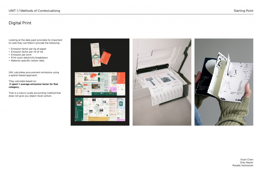
Prior to this project, I always felt intimidated by and under-qualified to engage with socio-environmental issues through design. The UAL Net Zero project reframed this by situating the challenge within a context I was already familiar with. Having always gravitated toward print-based practice, focusing on print carbon emissions gave me an accessible and personal entry point into the broader climate crisis.
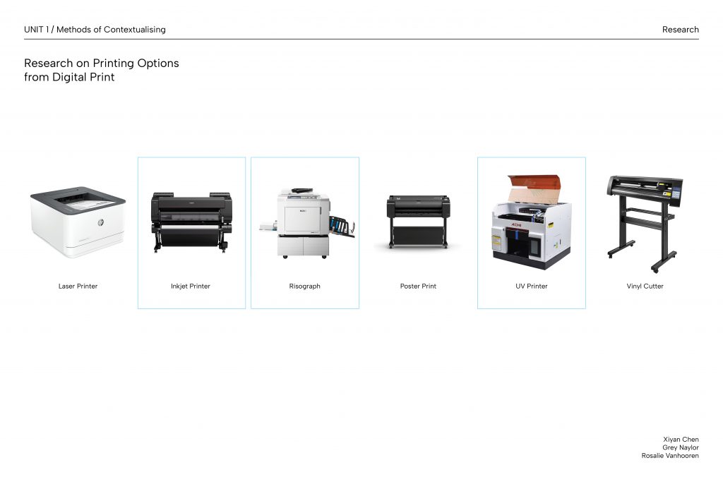
Engaging with UAL’s carbon data forced me to reflect on my personal carbon footprint through material choices, including paper selection, printing methods and waste management. This informed our decision to work with both digital and printed formats as a way to consciously moderate our material output in a project specifically concerned with print consumption.
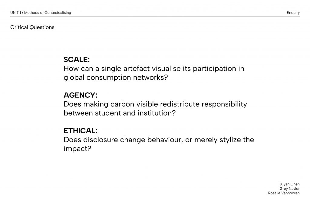
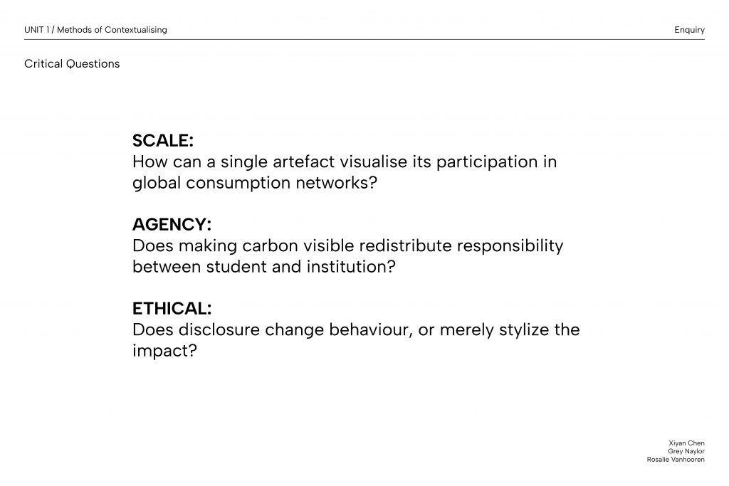
Our iterative process also deepened my understanding of critical graphic design. As a team, we discussed whether visualising carbon data could really prompt behavioural change, or whether it risked becoming another layer of greenwashed branding in an already oversaturated visual landscape. At times this ideological pursuit has hindered my approach to visual exploration. Ultimately, I came to understand that functionality and experimental aesthetics are not naturally opposed, but that negotiating between them requires designers to be explicit about their design intentions.
Annotated Bibliography
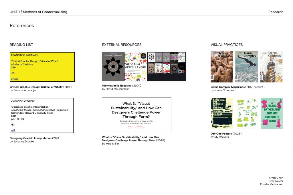
- Critical Graphic Design: Critical of What?
Francisco Laranjo investigates the purpose of “critical graphic design” and refers to Ramia Maze’s three forms of criticality: 1) provoking internal speculation of design decisions, 2) challenging conventional paradigms, and 3) addressing relevant societal issues. These principles informed our project as we critically examined CSM’s printing CO2 emissions.
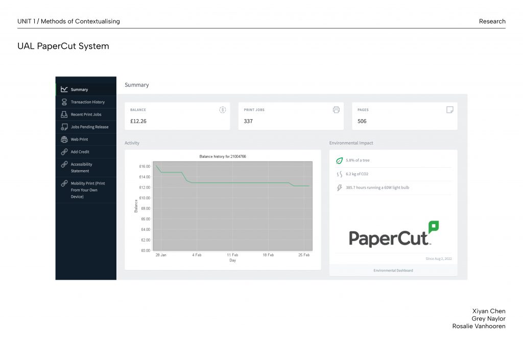
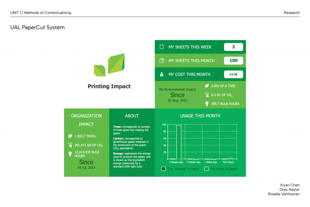
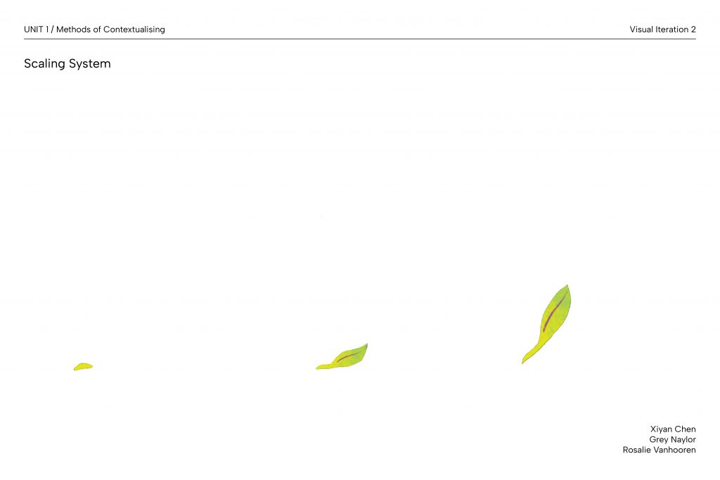
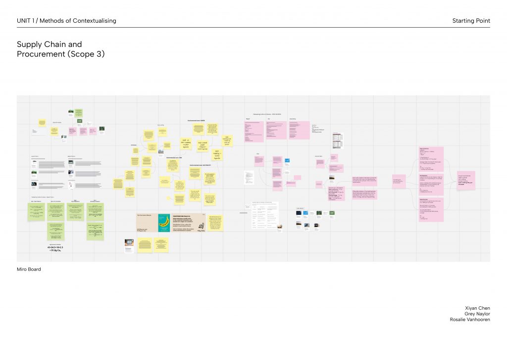
Our reflexive focus on understanding our own CO2e contribution within the wider institution satisfies the first form, as does our eventual choice not physically delivering the envisioned printed outcome. This reflection led us to critique the existing UAL Papercut system, which presents CO2 data as incomprehensible quantitative figures that appear meaningless in everyday contexts. By introducing visual infographics and comparative scaling to prompt behaviour change, we challenged this design paradigm. Together, these address the third form where we explored the pressing socio-environmental issue of carbon emissions in institutional printing. Laranjo also notes the “increasing reliance on other discipline’s methodologies” in design. This was evident in our research stage where gathering relevant data and domain knowledge was essential before approaching the issue through design intervention.
Laranjo, F. (2014) Critical Graphic Design: Critical of What? | Modes of Criticism. Available at: https://modesofcriticism.org/critical-graphic-design/ (Accessed: 22 February 2026).
- Designing Graphic Interpretation
Johanna Drucker suggests that graphic interpretation has changed from a textual, linear practice to multi-dimensional spaces in the digital environment. She argues that designing new intellectual forms of interpretation also means designing the container that delivers this information.
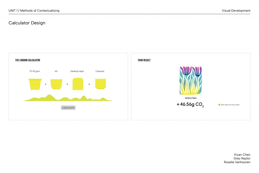
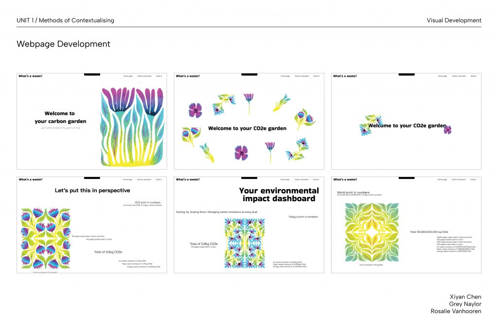
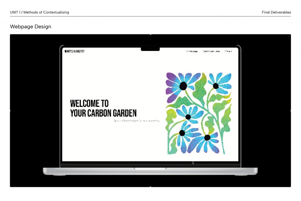
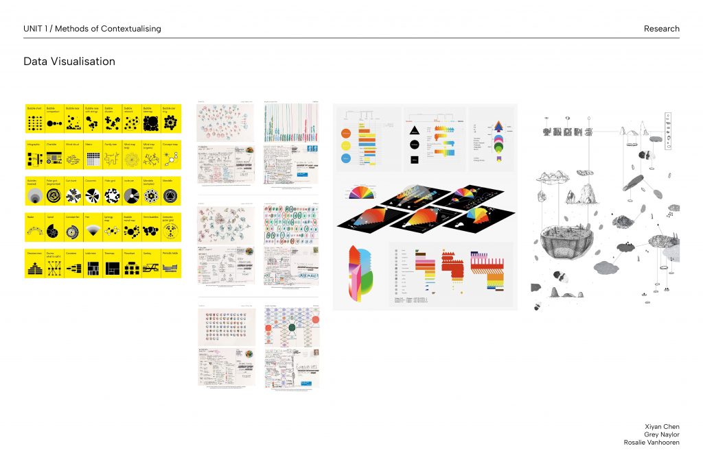
Our webpage design reflects this change in graphic communication, where we took advantage of the “flexibility” and “re-inscribability” of the screen to present various forms of “diagrammatic” and “constellationary” information about printing carbon emissions. The live update of data also positions the issue as a shared responsibility between the individual and the institution, which shifted the notion of authorship from being independent to “collective”.
Drucker also states the idea that “knowing is situated in lived lives” and asks if we will “think differently because of the ways interpretation takes shape”. This shaped our critical inquiry into whether disclosing and reinterpreting information can induce genuine behavioural change, or whether making carbon emissions visually legible risks remaining a surface-level intervention.
Drucker, J. (2014) ‘Designing graphic interpretation’, Graphesis: visual forms of knowledge production. Cambridge, Massachusetts London: Harvard university press (MetaLABprojects).
- What Is “Visual Sustainability,” and How Can Designers Challenge Power Through Form?
Benedetta Crippa discusses the concept of “visual sustainability” as design that can be sustainable not only through its messaging or materiality, but through its form and function. She argues that sustainable design should challenge conventional power structures through its visual aesthetic and design intents, rather than merely conveying environmental facts.
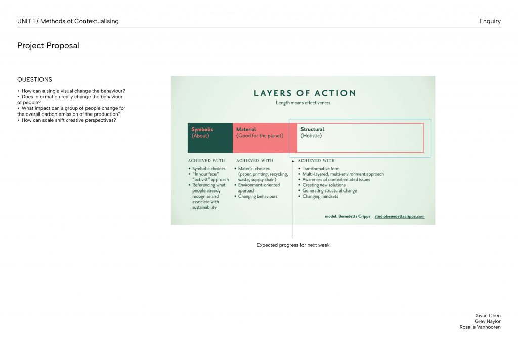
Crippa’s Layers of Actions diagram demonstrates three stages of sustainable design, which guided our project from working at the symbolic and material level to eventually approaching structural change. Our project synthesised Crippa’s idea of integrating design as part of the sustainable solution by incorporating our scaling system within existing UAL printing services. However, this decision does not completely align with Crippa’s emphasis on challenging dominant visual forms, as working within an existing institutional system inevitably means adhering to its underlying design conventions to some extent.
Crippa also suggests that sustainability becomes incomprehensible when environmental consequences are “far away in time and space”. We approached this problem by providing users with specific carbon emission figures at the point of printing, integrating environmental literacy into the act of printing, and into the here and now, rather than deferring it.
Miller, M. (2020) ‘What Is “Visual Sustainability,” and How Can Designers Challenge Power Through Form?’, Eye on Design, 9 December. Available at: https://eyeondesign.aiga.org/what-is-visual-sustainability-and-how-can-designers-challenge-power-through-form/ (Accessed: 25 February 2026).
- Sustainable Graphic Design
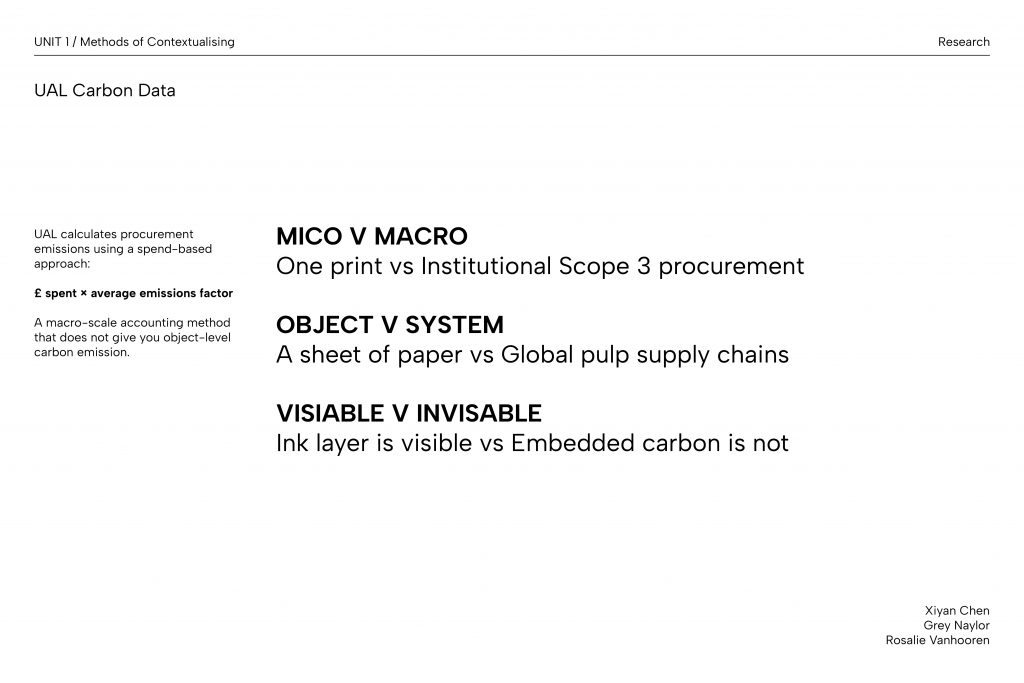
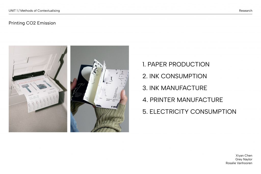
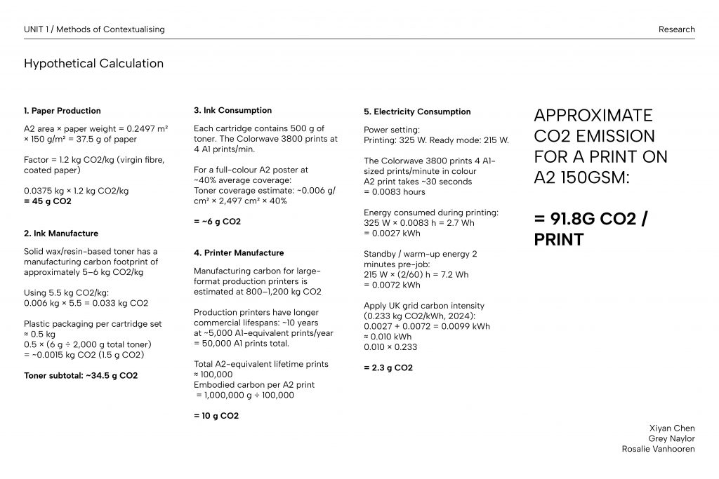
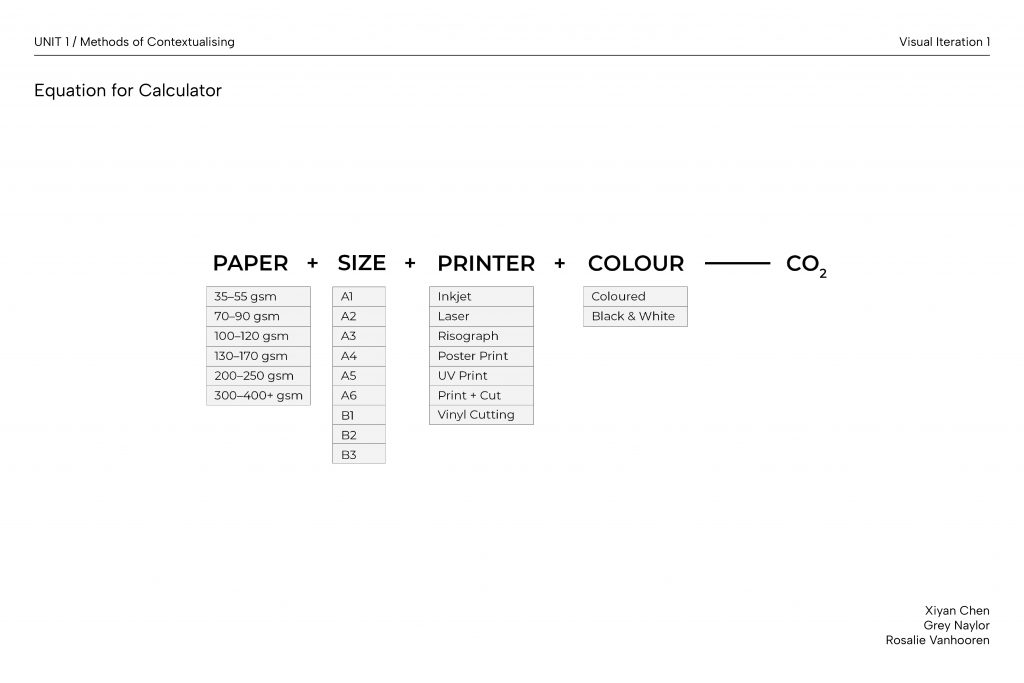
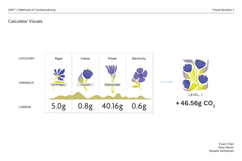
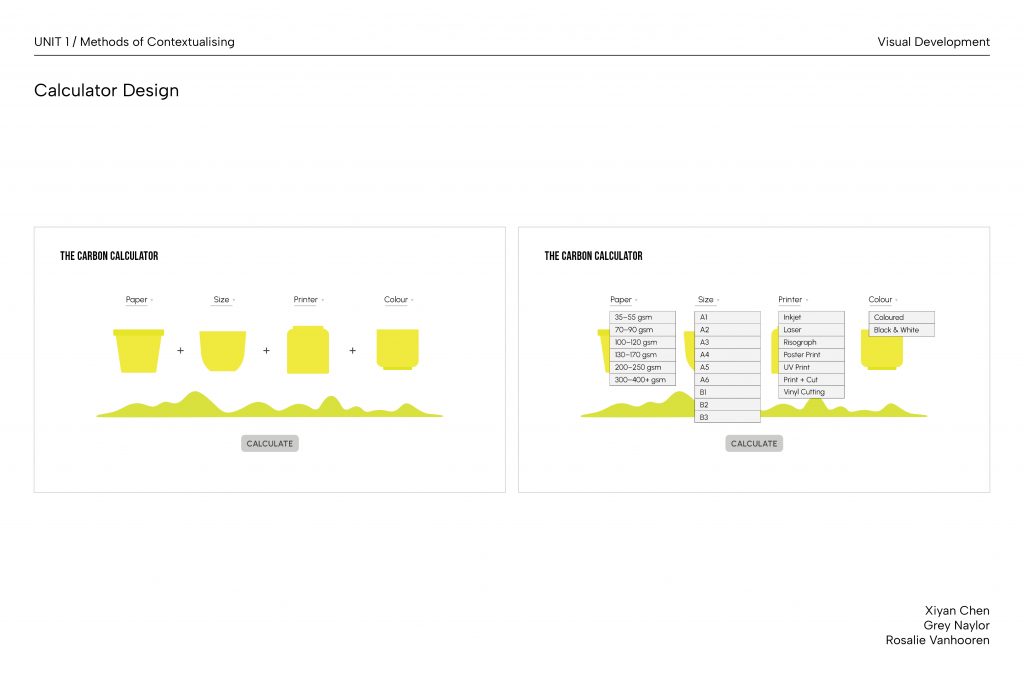
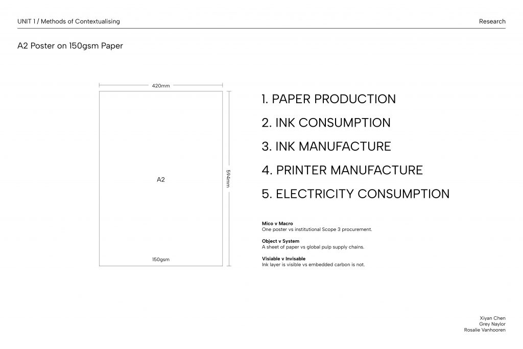
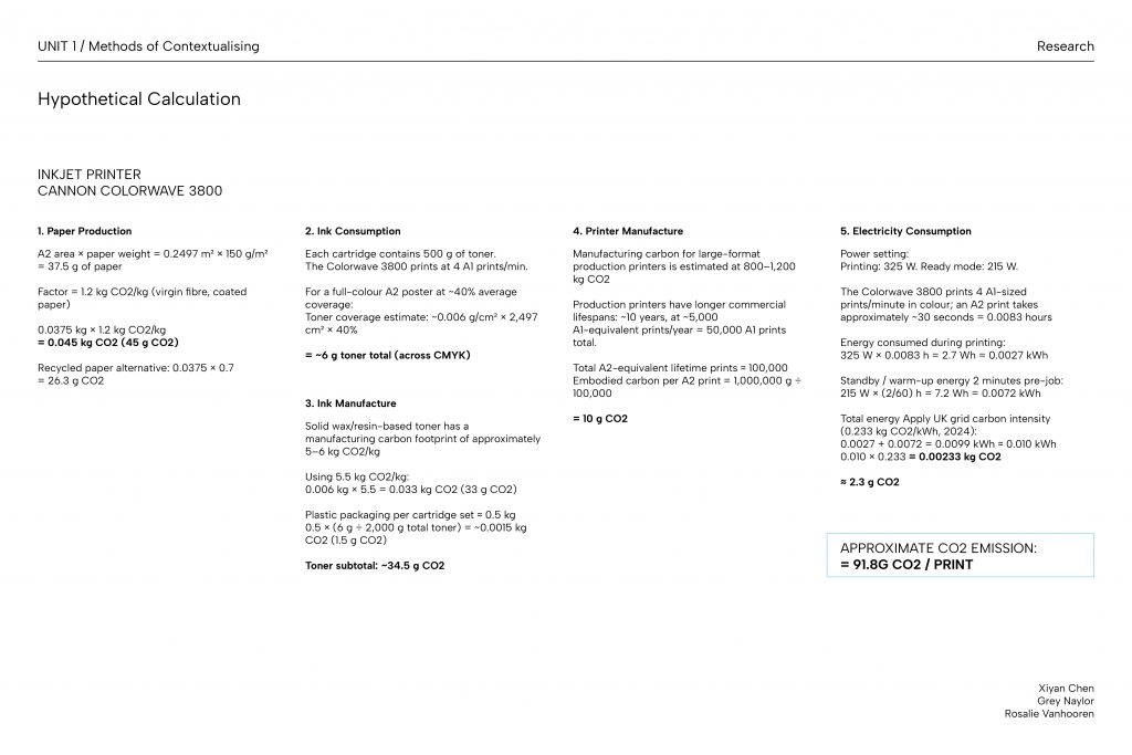
Alistair Hall’s discussion on methods of sustainable practices with a focus on print production grounds our project within the broader context of graphic designers’ role in the climate crisis. His focus on paper weight, ink coverage and energy cost directly informed the variables underpinning our carbon calculator for UAL’s printing emissions.
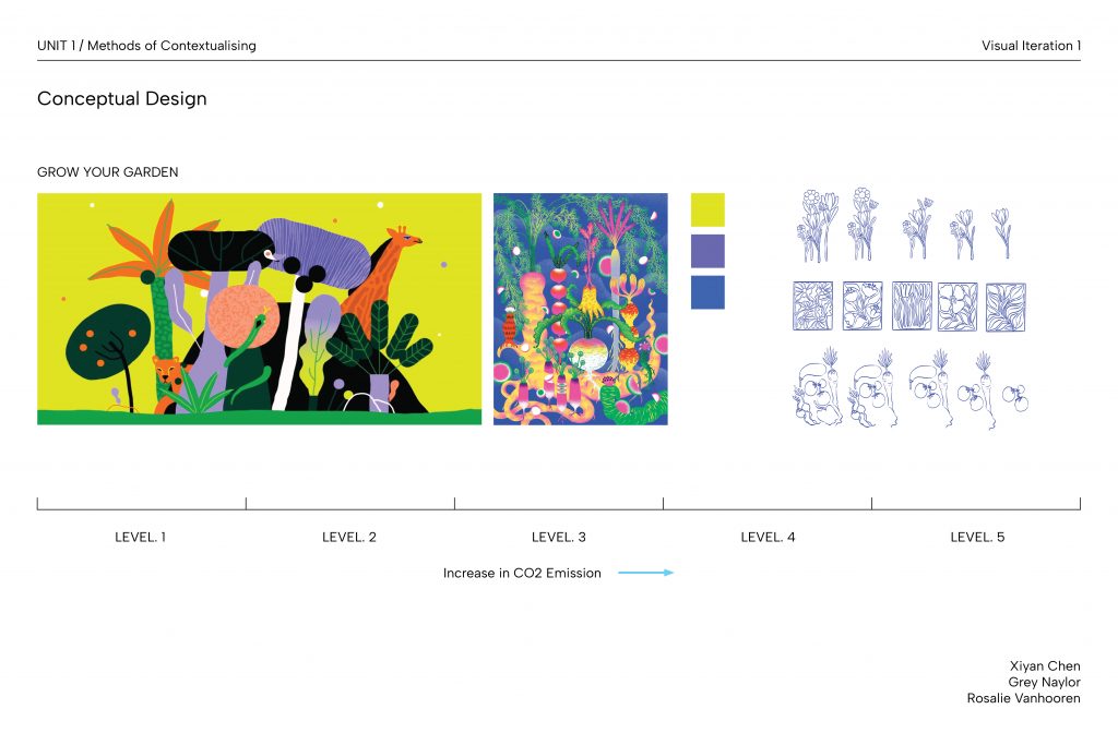
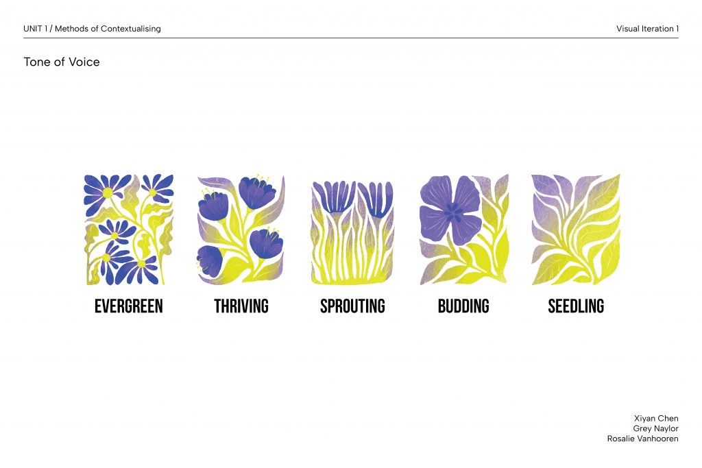
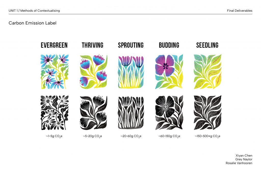
Hall argues for the need for structural interventions in the printing process to ensure sustainable decisions. These include certification schemes, procurement policies and institutional remit on printers and paper-stock, which inspired the design of our labelling system. Based on these, we categorised carbon emission ranges and provided visual cues to guide sustainable decision making.
Hall also considers the tension between print and digital by acknowledging the lack of a definitive answer. His suggestion to focus on the functionality and purpose of these design choices aligned with our approach: rather than discouraging all forms of print, we prioritised helping users make informed choices.
Hall, A. (2024) ‘Sustainable Graphic Design – We Made This short guide’, We Made This, 15 January. Available at: https://wemadethis.co.uk/blog/2024/01/sustainable-graphic-design/ (Accessed: 25 February 2026).
- Icarus Magazine
The Icarus Complex is an independent climate publication available in both print and digital formats. It discusses issues around the environmental crisis in an empathetic tone by framing sustainability as a shared human concern rather than a political ideology.
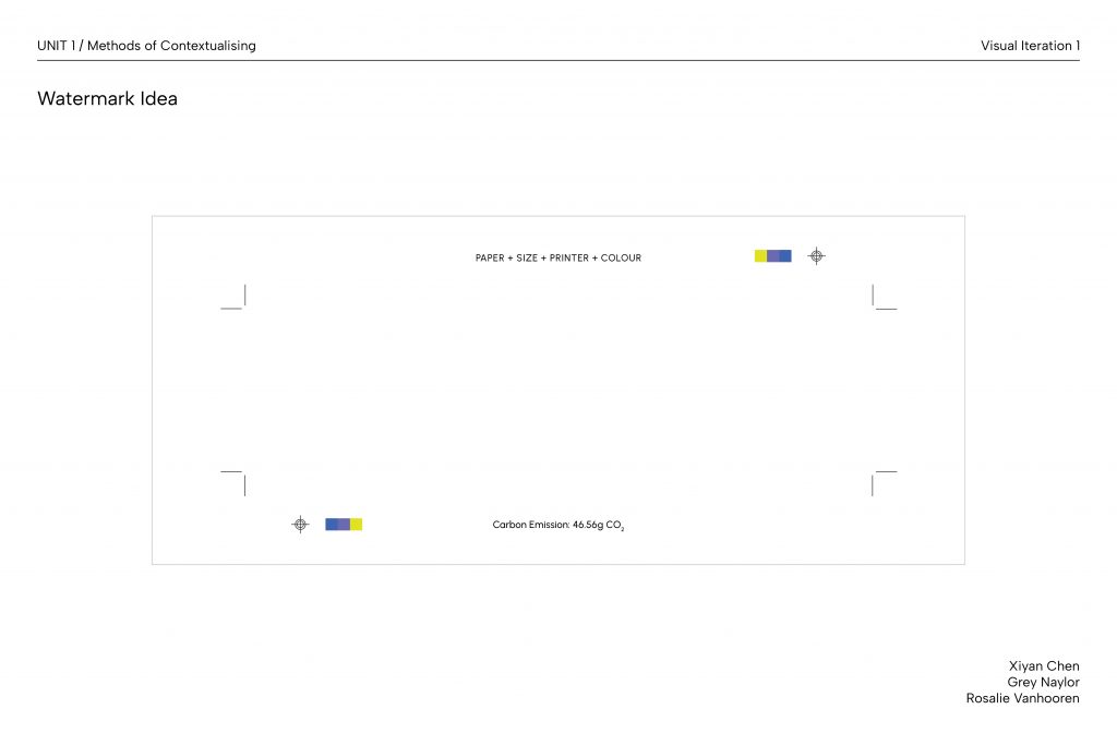
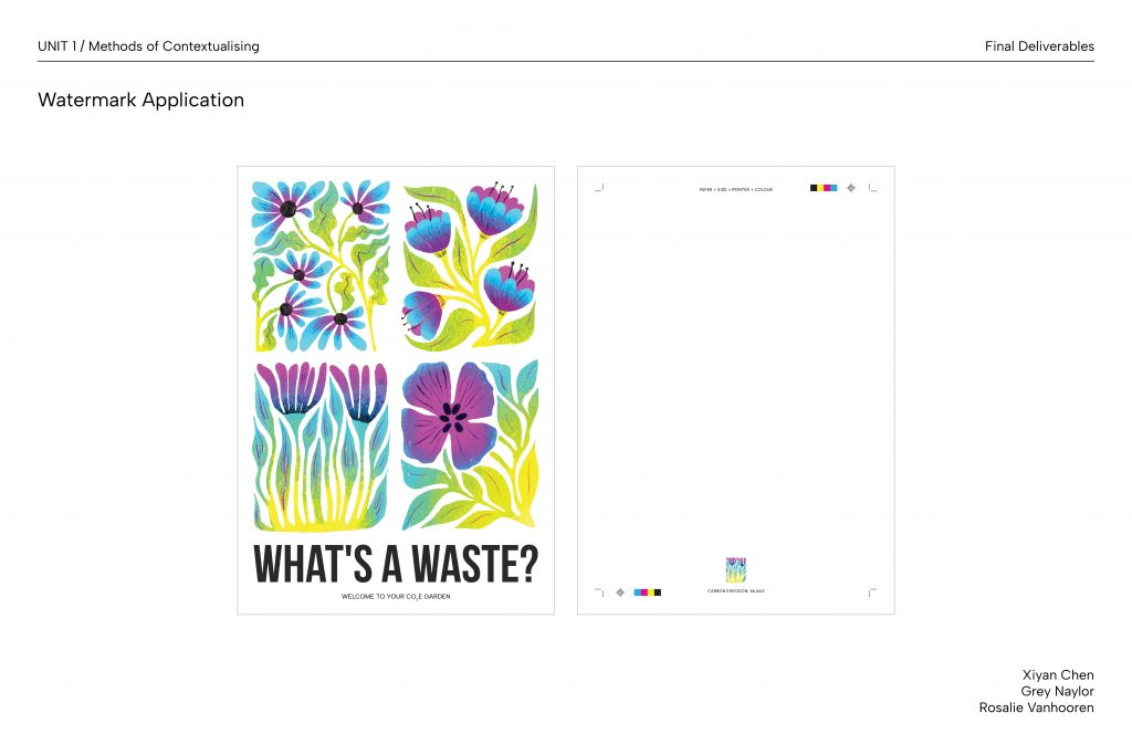
Similar to the Icarus Complex, we adopted a dual-format approach: a web platform for immediate, accessible carbon emission data, and a printed watermark for sustained awareness through its physical permanence.
Icarus Complex also rejects conventional greenwashing aesthetics through its use of natural tones and an earthy palette, in contrast to the bright greens typical of sustainable branding. We drew on this in our own colour choices, incorporating nature-driven tones and visual elements to develop our gardening concept.
We also noted Icarus Complex’s delivery of complex carbon data in shorter prose to make information navigable rather than intimidating. To assist in communicating quantitative data, we condensed information into a five-level labelling system and contextualised them against real-world scales.
Renssen, S.V. (2020) ‘CO2 removals: six things you need to know’, Icarus Complex, 17 January. Available at: https://icaruscomplexmagazine.com/co2-removals-six-things-you-need-to-know/ (Accessed: 27 February 2026).
- Day One Poster Series
Day One is a community project published by My Pockets that gathered a series of posters produced by students from Sheffield to make a collaborative statement on the climate crisis.
The unfiltered collection of messages, ranging from earnest urgency to sardonic defiance, delivers a realistic overview of the public’s engagement with environmental issues. It breaks down the barrier of registering this serious but often incomprehensible information in the daily situation by bringing in some humour and mischief. This aligned with our approach to subtly encourage behavioural change by embedding carbon literacy in the act of printing, lowering the stakes of engaging with this difficult and potentially confronting issue.
Additionally, Day One combines hand-drawn elements and varied mark-making patterns with bold sans serif typefaces and a vibrant colour palette, celebrating physical tactility while keeping the design accessible. We were inspired by this visual language in our own assets, and chose to use raw outlines, bold typefaces and layered textures to establish a friendly, approachable aesthetic.
Tree, E. (2026) What do children have to say about climate change? This collaborative poster series investigates, It’s Nice That. Available at: https://www.itsnicethat.com/articles/my-pockets-day-one-graphic-design-project-200125 (Accessed: 27 February 2026).